← All work

Case study 02 — Client work at Metafic


A grocery app where the total at checkout is the total you expected.

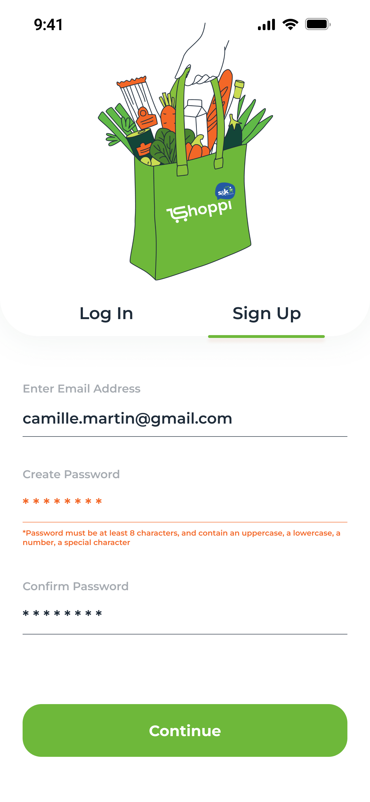
Shoppi: groceries ordered in a few taps, paid by saved card and tracked to the door. Designed end to end, in English and French.
105Screens: 54 English, 51 French
2Languages, one layout
12Top categories
3Tracking stages, store to door
Role
UI/UX Designer
Company
Metafic
Languages
English + French
Platform
Mobile app
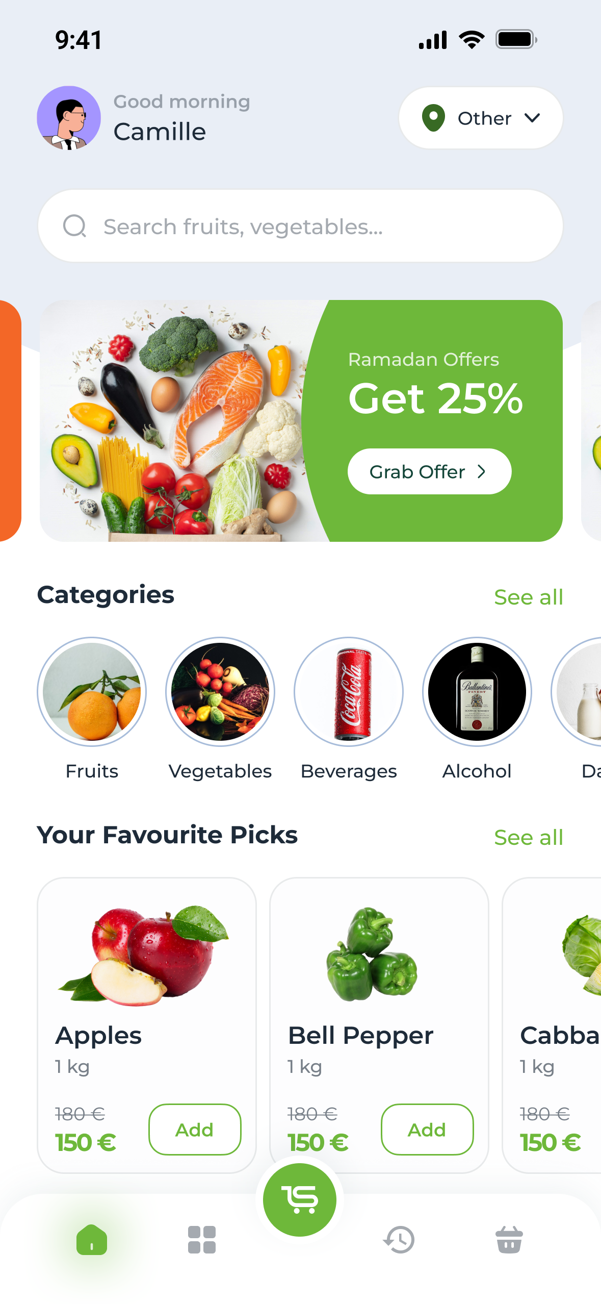
Shoppi home: Good morning, Camille, a search field, a Get 25% offer banner, round category photos and Your Favourite Picks with prices and Add buttons
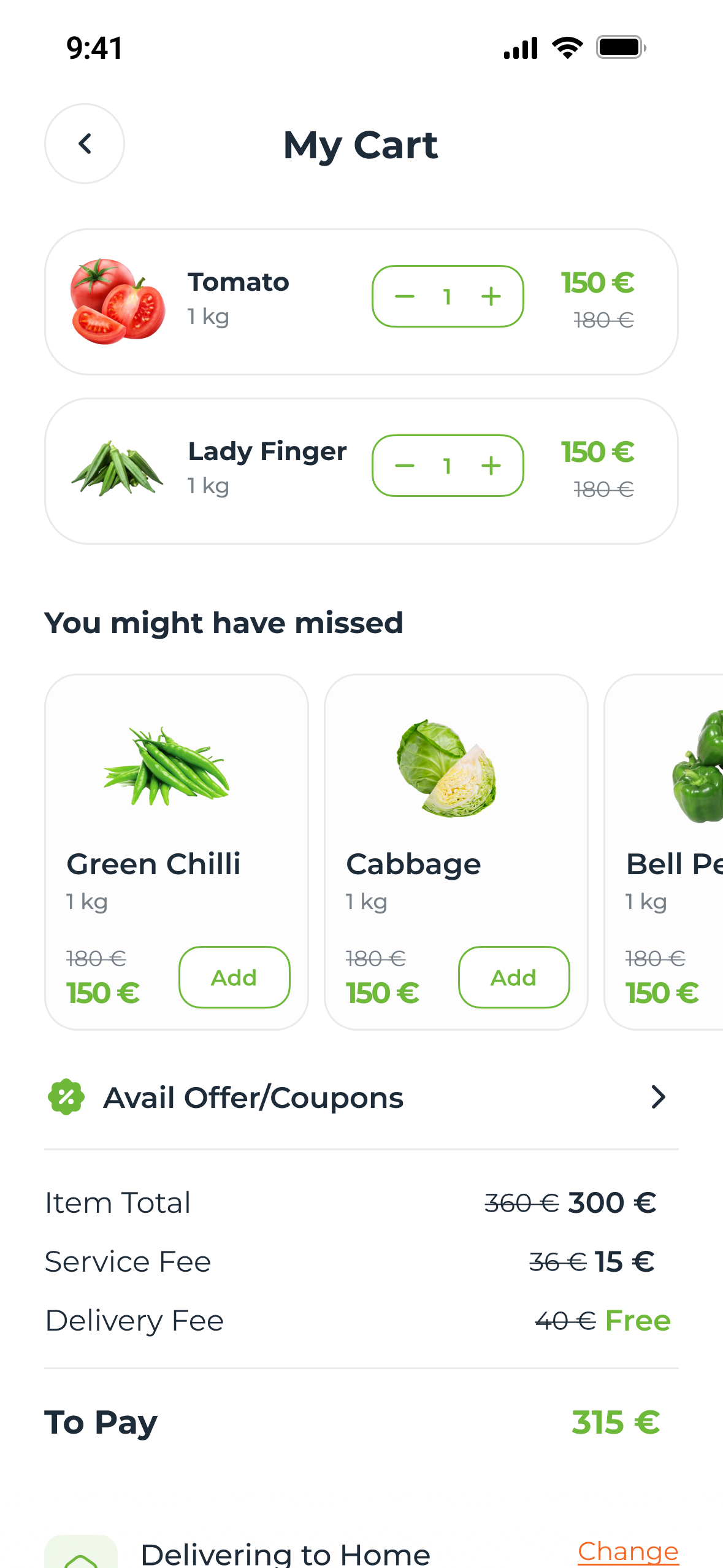
My Cart: two items with quantity steppers, struck-through original prices, suggestions under You might have missed, and a fixed bar with the delivery address and Continue to payment

The problem

01 — Why carts get left


People don’t leave a cart because they stopped wanting food. They leave when the total surprises them.

  • The brief I set: make the weekly shop faster than the walk to the store, and the total at checkout the total you expected.

70.22%Average online cart abandonment, across 50 studies

  1. Extra costs too high40%
  2. Delivery too slow20%
  3. Didn’t trust the site with card details19%
  4. Had to create an account18%

Fig. 01 — Reasons shoppers leave at checkout. Source: Baymard Institute

Who it’s for

02 — Three kinds of shop


Three kinds of shop, one basket.

The weekly stockerPlans ahead

Buys the same things every week, and resents rebuilding the basket.

The top-up shopperRan out of milk

Wants two or three things, fast. Search and the wait are the whole experience.

The bilingual householdEnglish and French

Lives in two languages, and expects the app to follow.

User flow

03 — Before a single screen


Home at the centre; every branch ends in the same cart.
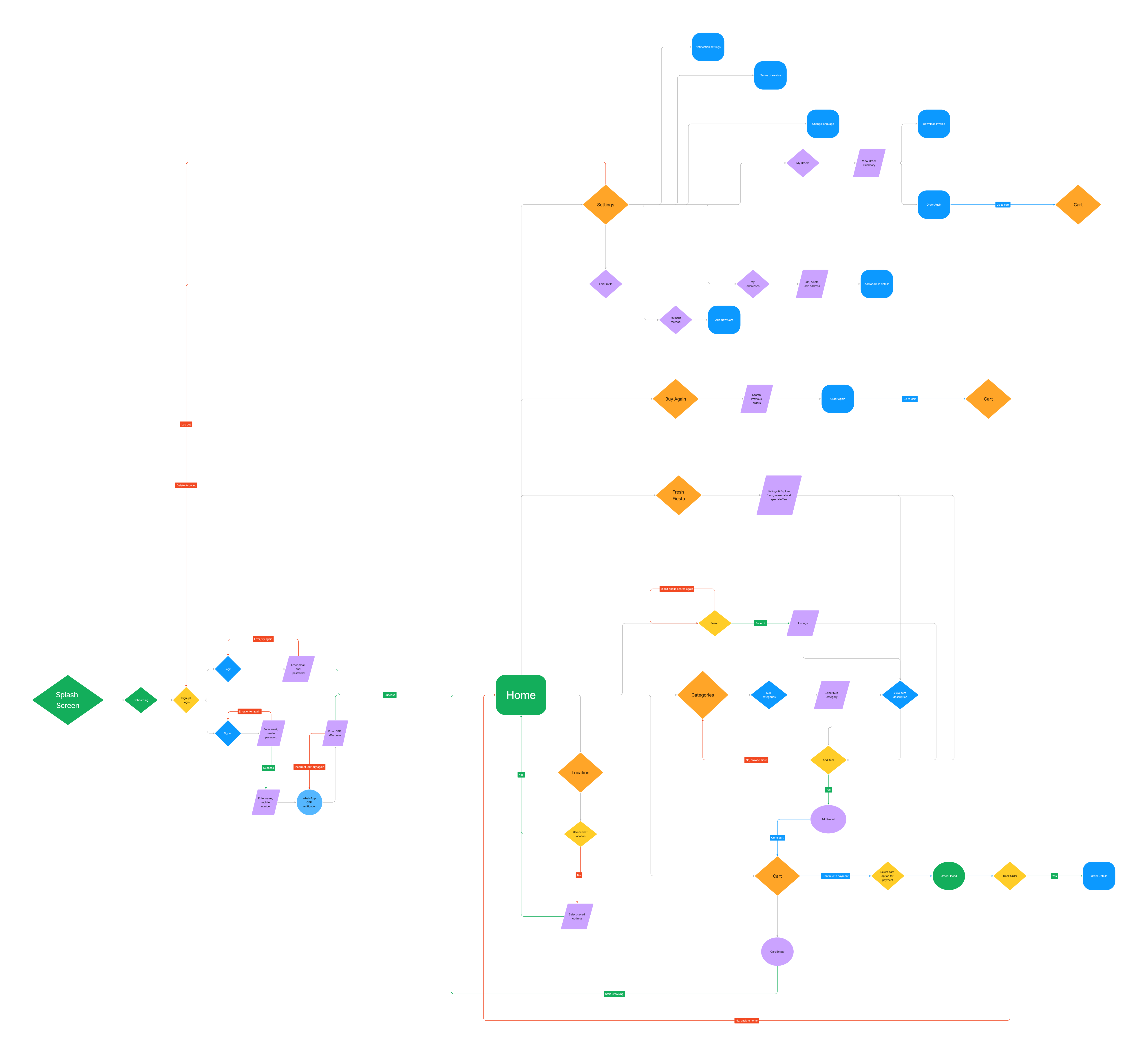
  • Sign-up and login, with retry loops for a wrong password or code.
  • Categories, search with a “not found, search again” loop, and offers.
  • Cart, payment, order placed, tracking; Buy Again and the account behind them.
The user flow: splash, onboarding and sign-up or login with WhatsApp OTP lead to Home; from Home, branches to location, categories, search, Fresh Fiesta offers, Buy Again and settings all lead to the cart, then payment, order placed and tracking
Fig. 03 — The flow, splash to reorder, failure loops in red

Browse and basket

04 — The aisles


Walk the aisles with one thumb; the cart is always one tap away.
Home: greeting, delivery location top right, search, an offer banner, categories and favourite picks
Home — search first, then offers and favourites
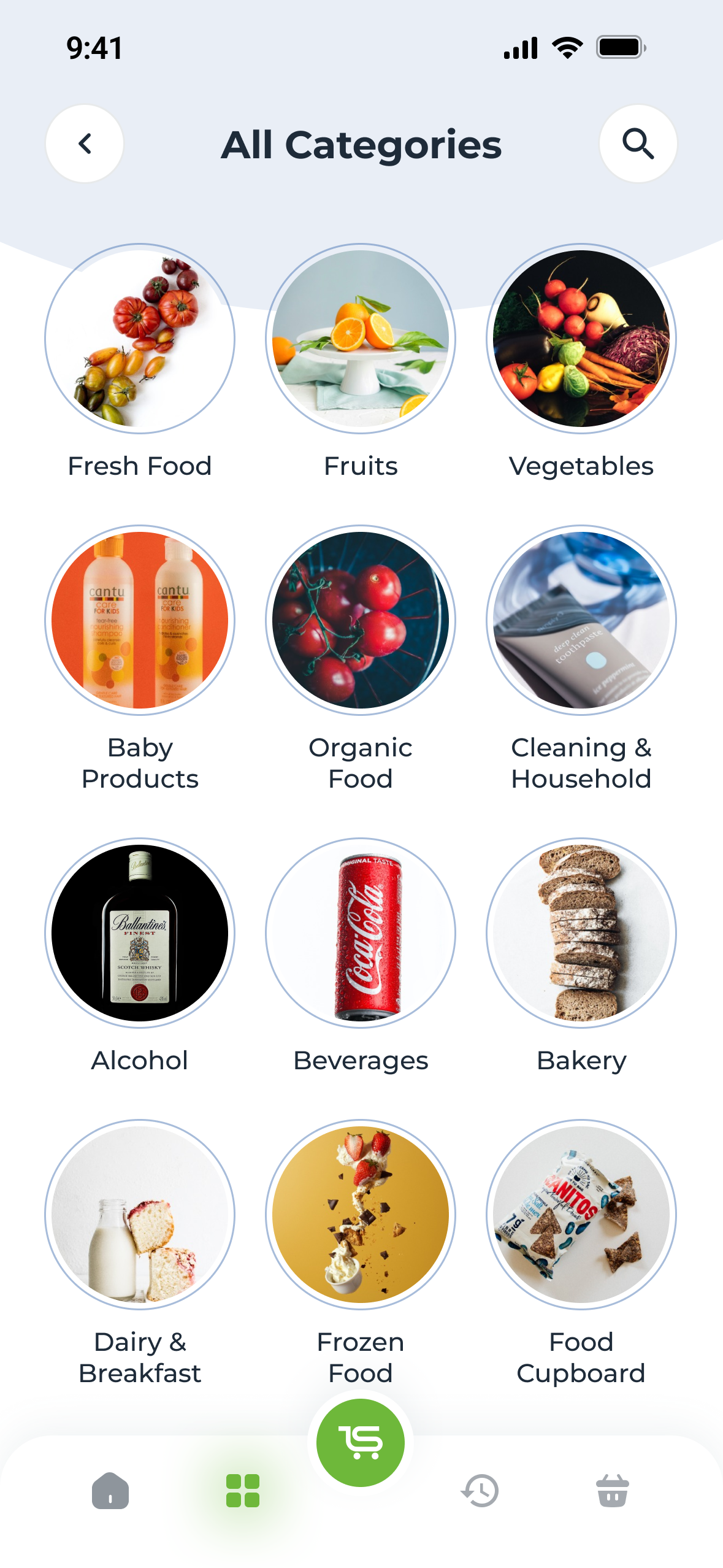
All Categories: twelve round photo tiles from Fresh Food to Food Cupboard
All categories — twelve aisles
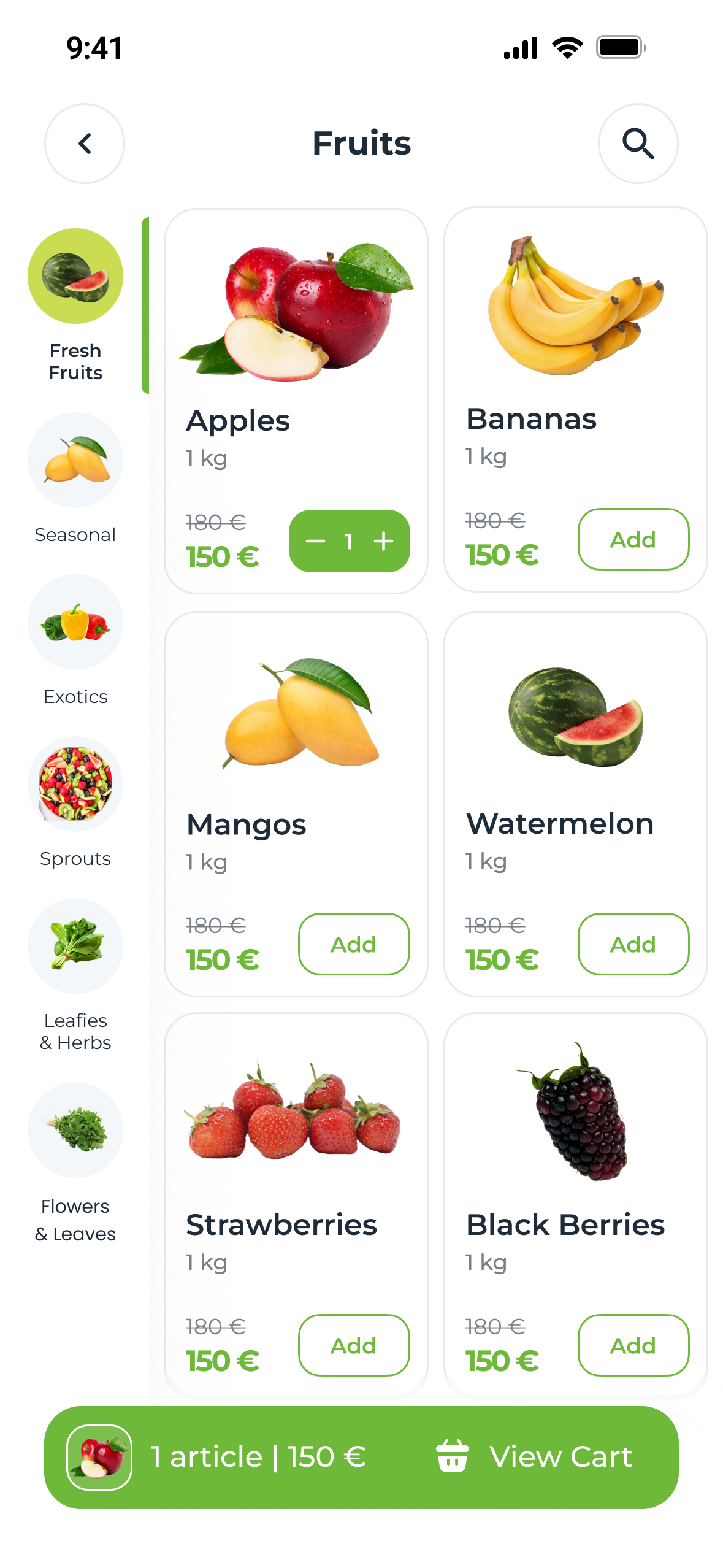
The Fruits aisle: a left rail of sub-categories with photo icons, products in two columns, Apples added with a stepper, and a green cart bar reading 1 article, 150 euros, View Cart
An aisle — sub-categories on a rail, the cart bar below
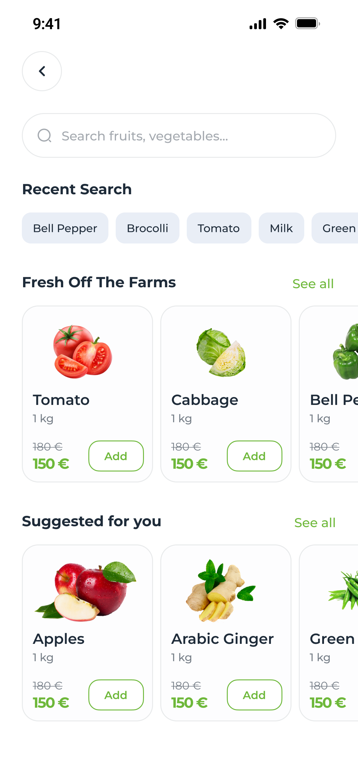
Search: recent searches as chips, then Fresh Off The Farms and Suggested for you
Search — recent terms are one tap
Motion — Add becomes a stepper, the cart bar follows

Up close

05 — Four decisions


Four parts carry the trust, so they got the most work.

A — The bill

Every fee on its own line

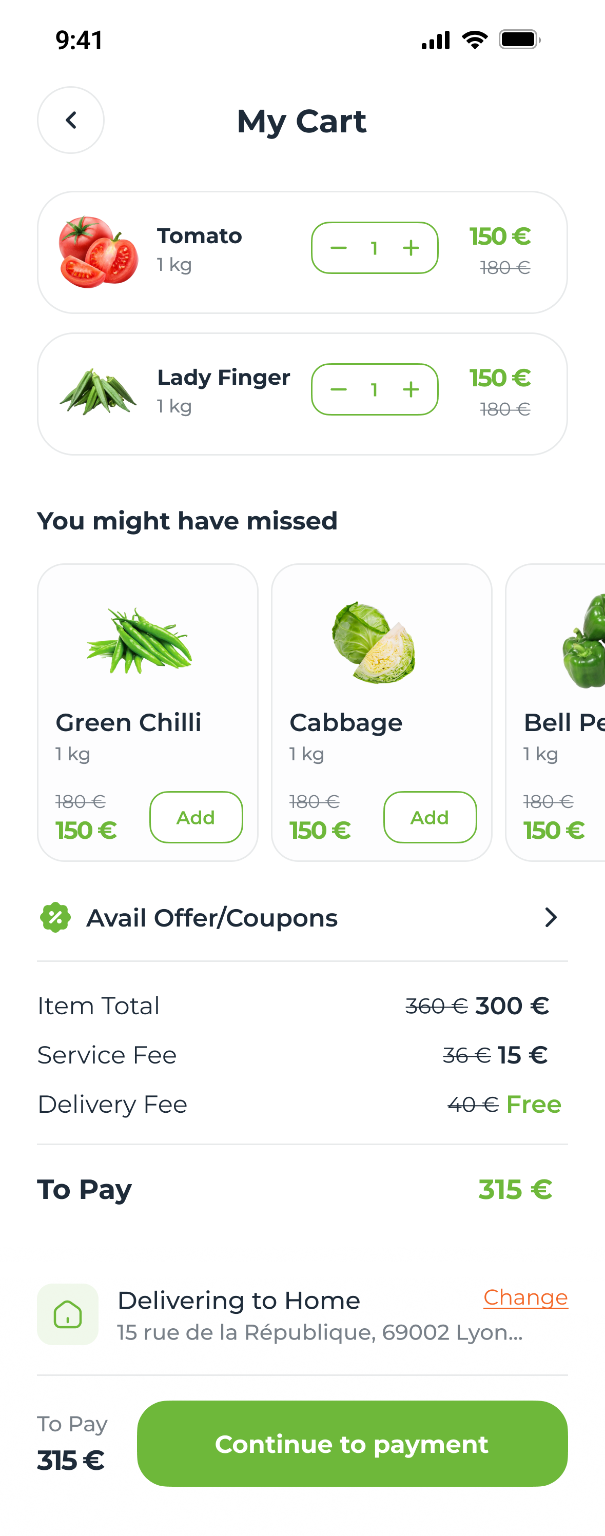
Item total, service and delivery, each with the saving struck through, before payment.
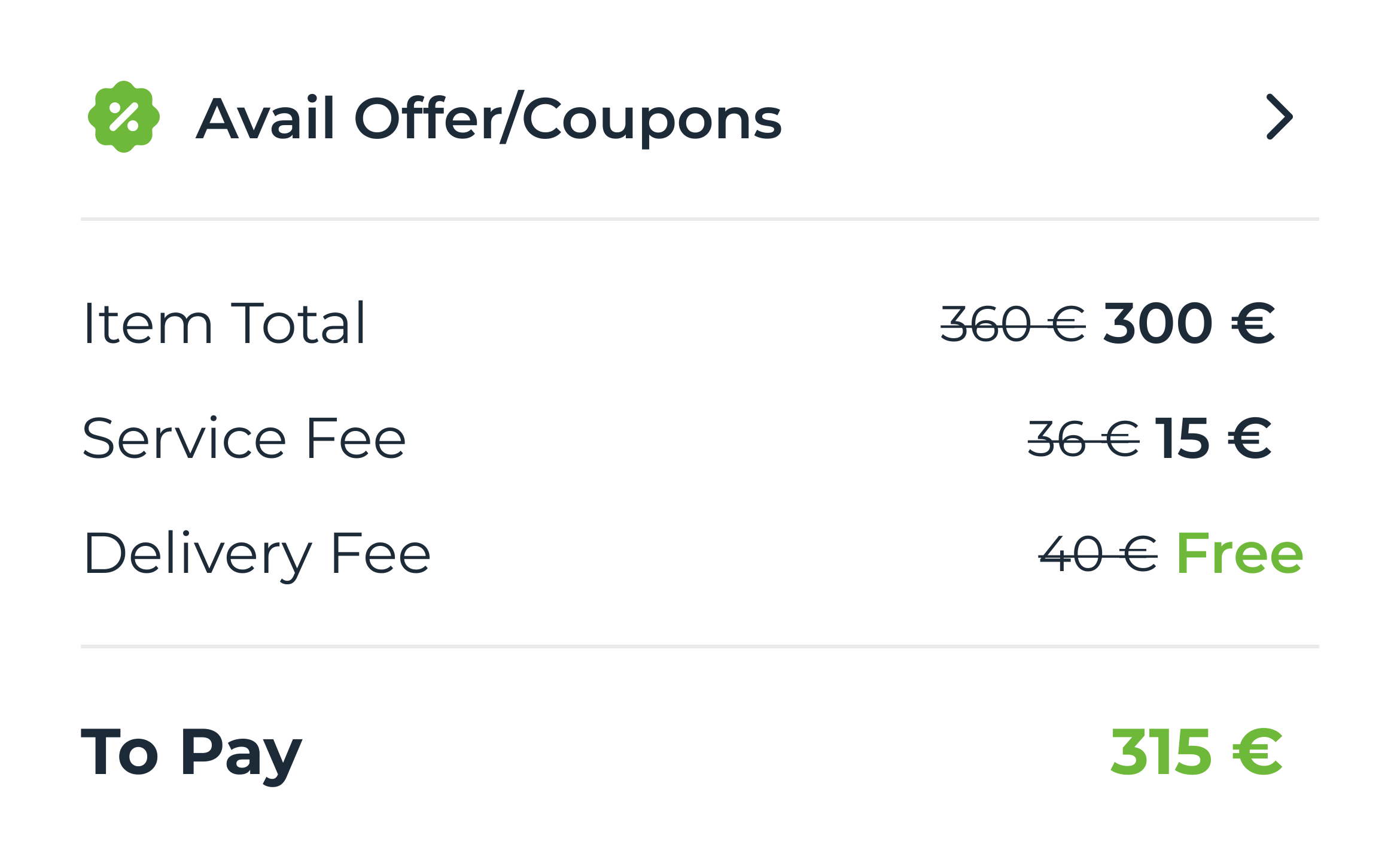
Bill details in the cart: Item Total 300 euros, was 360; Service Fee 15, was 36; Delivery Fee Free, was 40; To Pay 315 euros in green

B — Add

The button becomes the quantity

Once an item is in, Add turns into a stepper, and a cart bar holds the count and total.
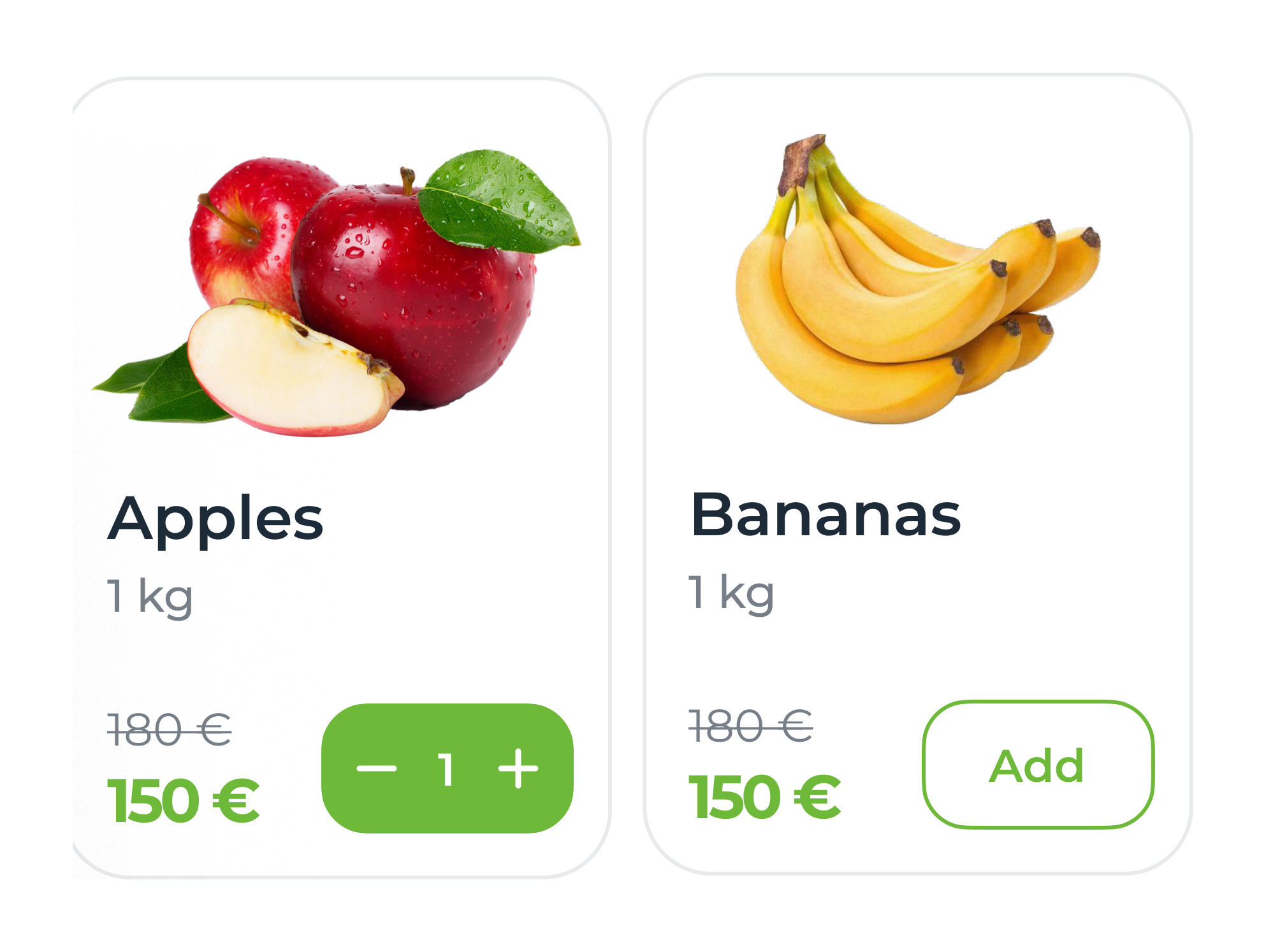
Two product cards: Apples, added, with a green minus 1 plus stepper; Bananas with an outlined Add button; both 150 euros, was 180

C — Sign-up

The code arrives where people already are

Name and mobile only; the screen says the OTP comes by WhatsApp before you tap.
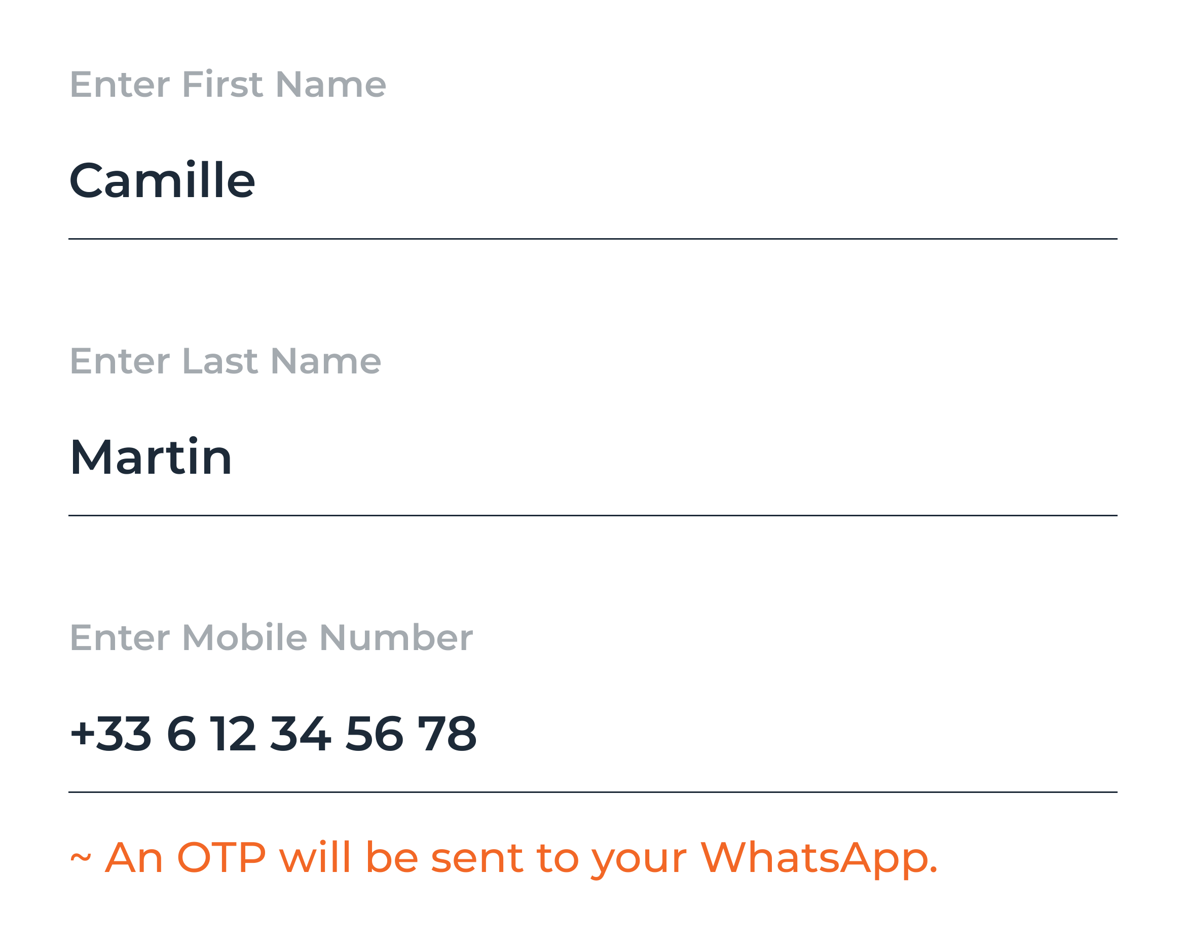
Sign-up fields: first name Camille, last name Martin, mobile +33 6 12 34 56 78, and an orange note: An OTP will be sent to your WhatsApp

D — Tracking

The delivery has a name

The rider, the store and your address as stops, with chat and call one tap away.
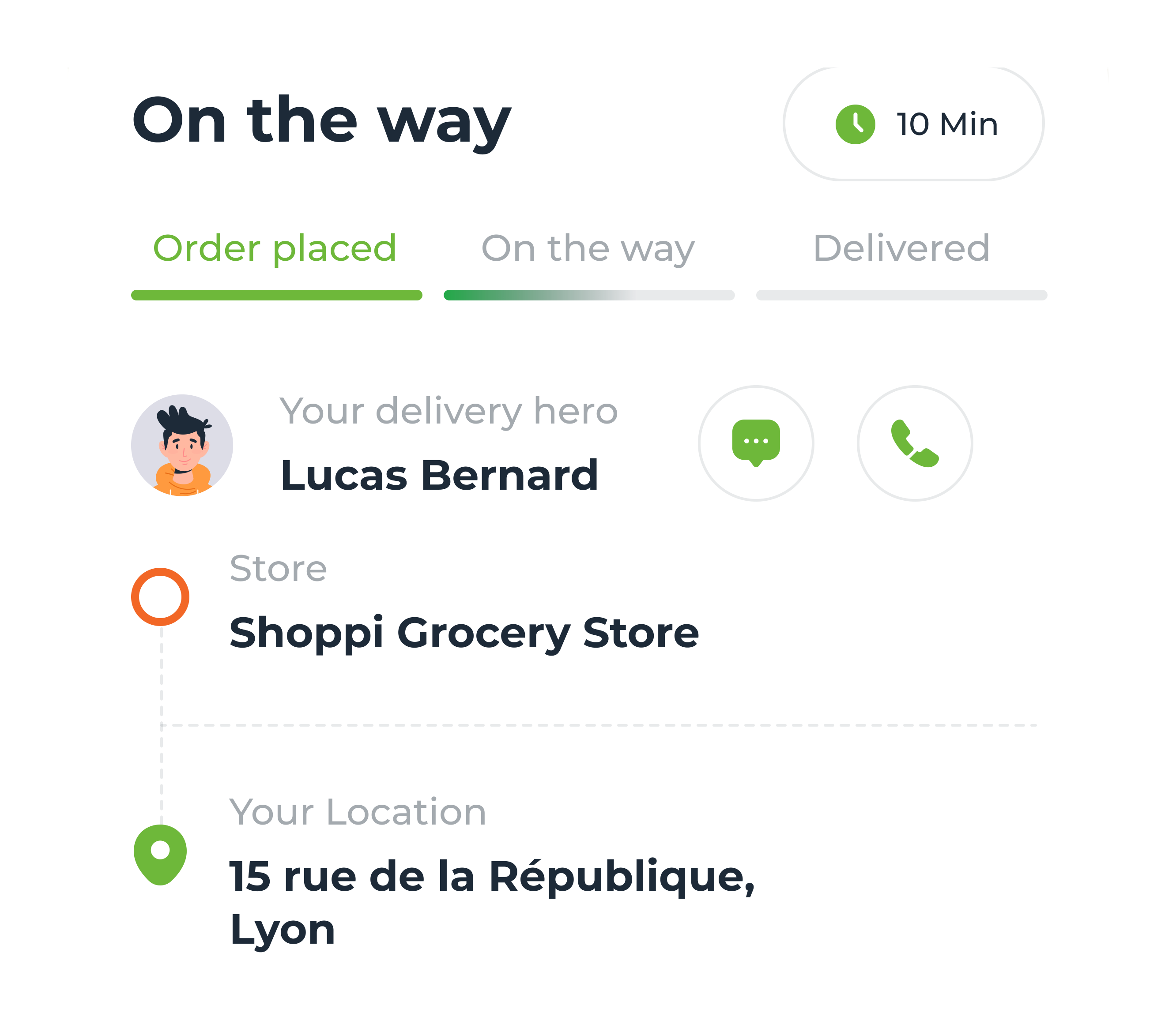
Tracking sheet: On the way, 10 min; stages Order placed, On the way, Delivered; your delivery hero Lucas Bernard with chat and call buttons; store Shoppi Grocery Store; your location 15 rue de la République, Lyon

Checkout to door

06 — Pay, then wait


One screen to pay; the wait is designed like part of the product.
Motion — bill, pay, placed, tracked
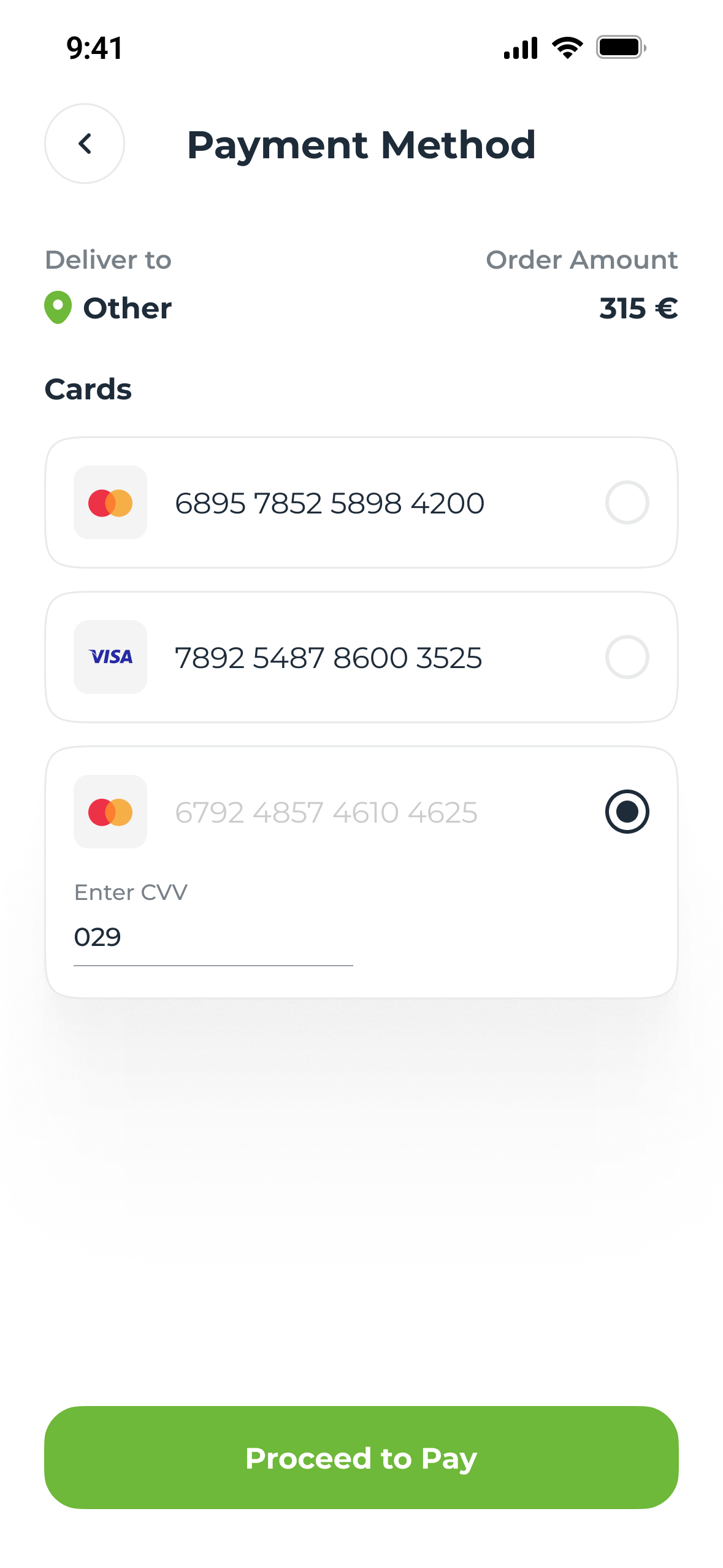
Payment Method: deliver to Other, order amount 315 euros, two saved cards and a third selected with its CVV field, and Proceed to Pay
Payment — CVV only for the card you pick
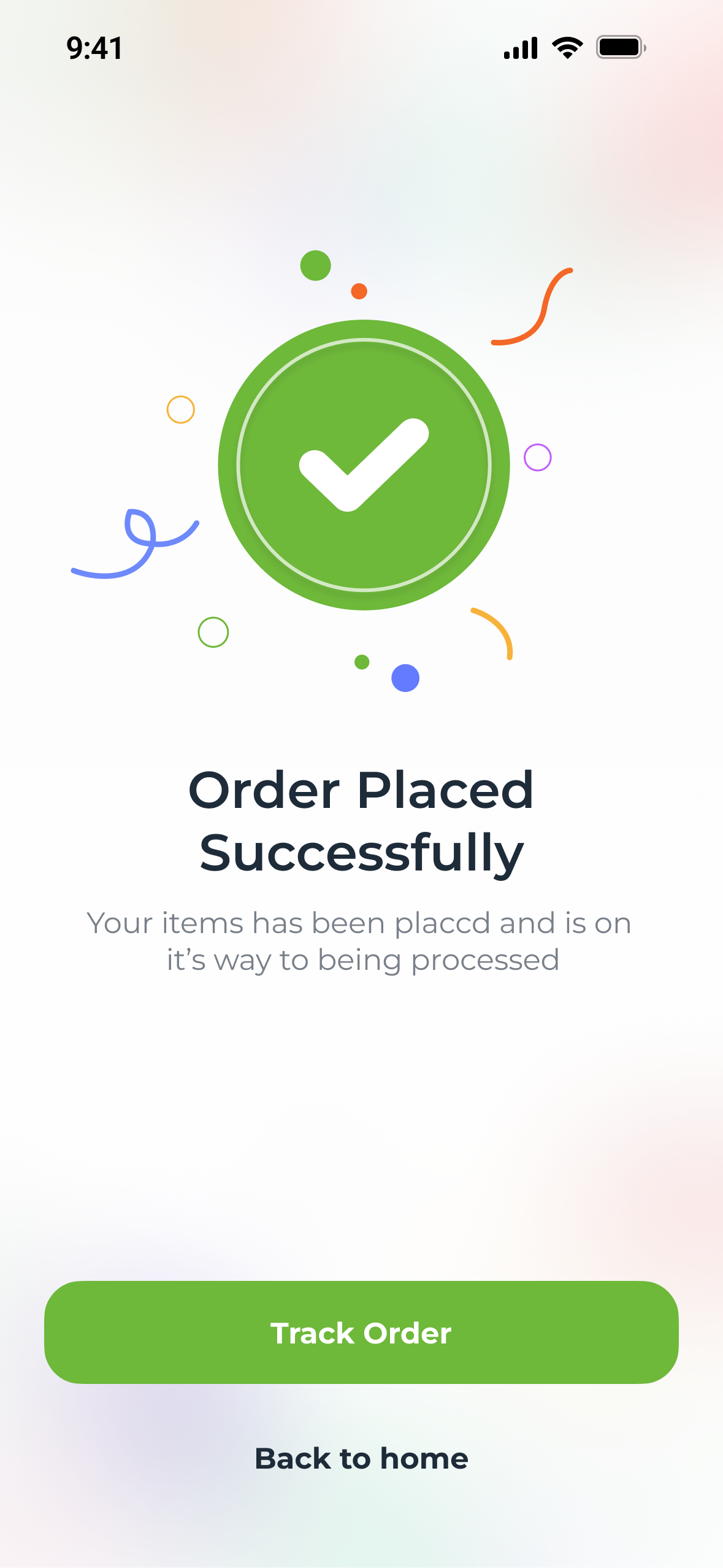
Order Placed Successfully: a green check, Track Order and Back to home
Placed — one next step
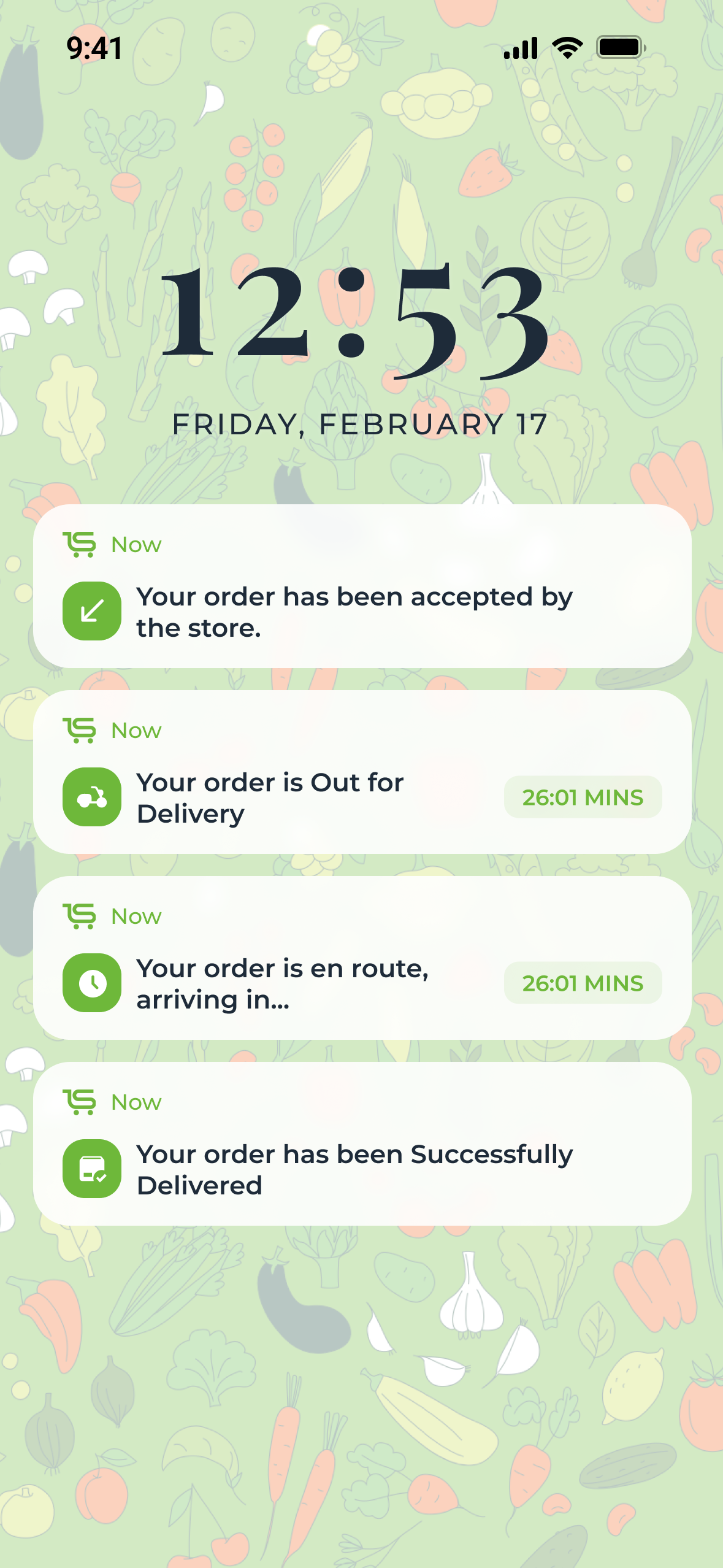
Lock screen notifications: accepted by the store, out for delivery, en route, delivered
Every stage arrives as a notification
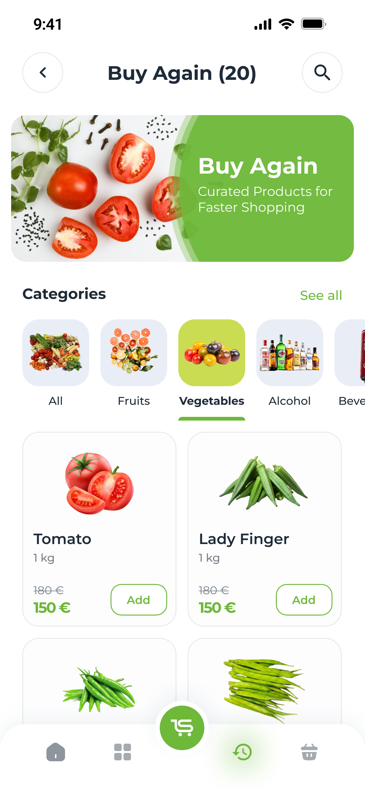
Buy Again (20): a banner, category filters and the products ordered before, each with Add
Buy Again — the next shop, half done

English and French

07 — Designed twice


Not translated at the end: every screen set again in French.
  • French strings run longer, so buttons, tabs and labels had to hold them.
  • Euros, Lyon addresses and French phone numbers, down to the error states.
Motion — the same home, in each language
The whole English cart: items, You might have missed, offers, bill details and the payment bar
My Cart — English
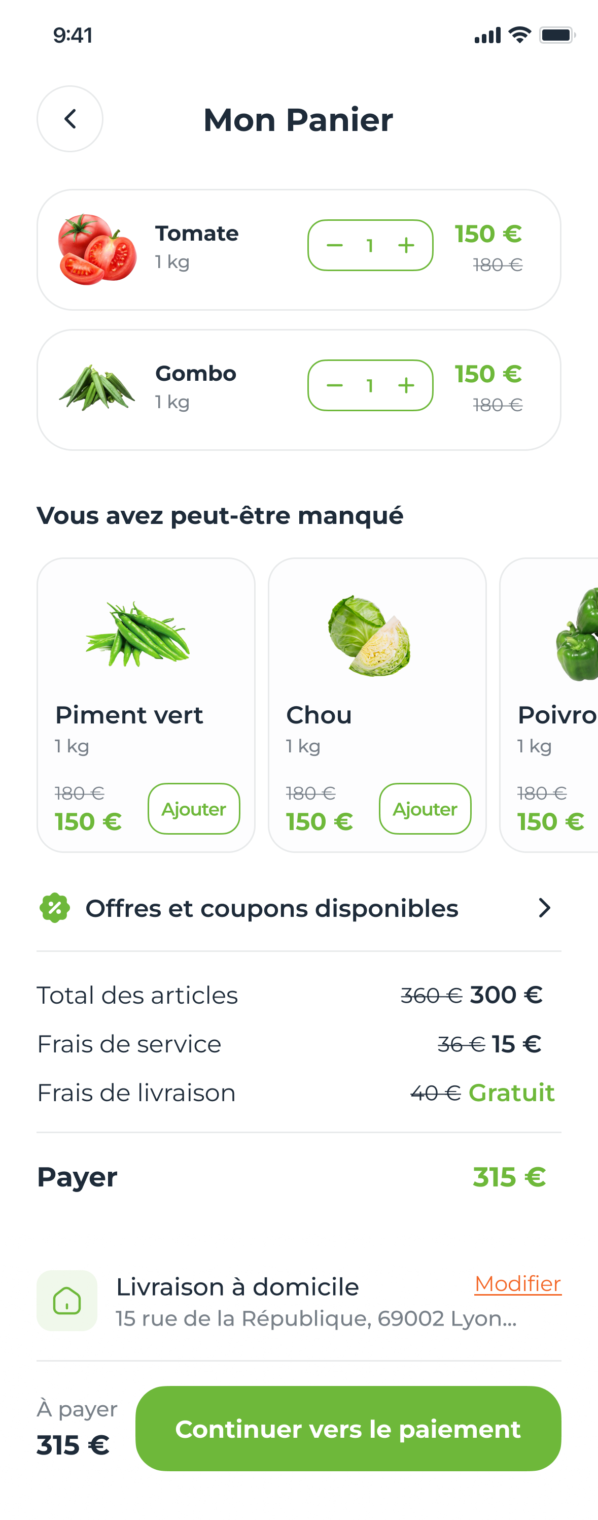
The same cart in French, Mon Panier, with the longer labels in the same layout
Mon Panier — French
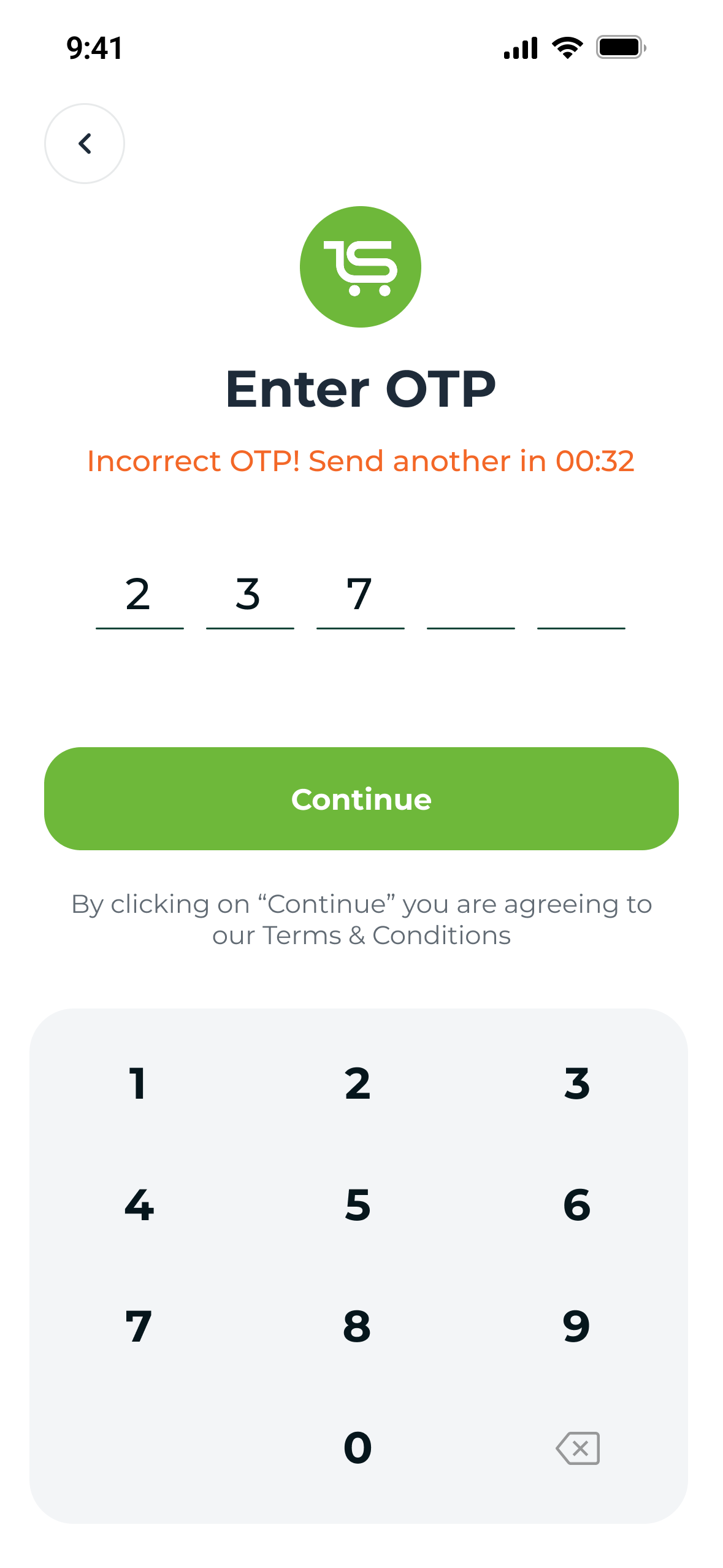
Enter OTP with an error in red: Incorrect OTP! Send another in 00:32, above a numeric keypad
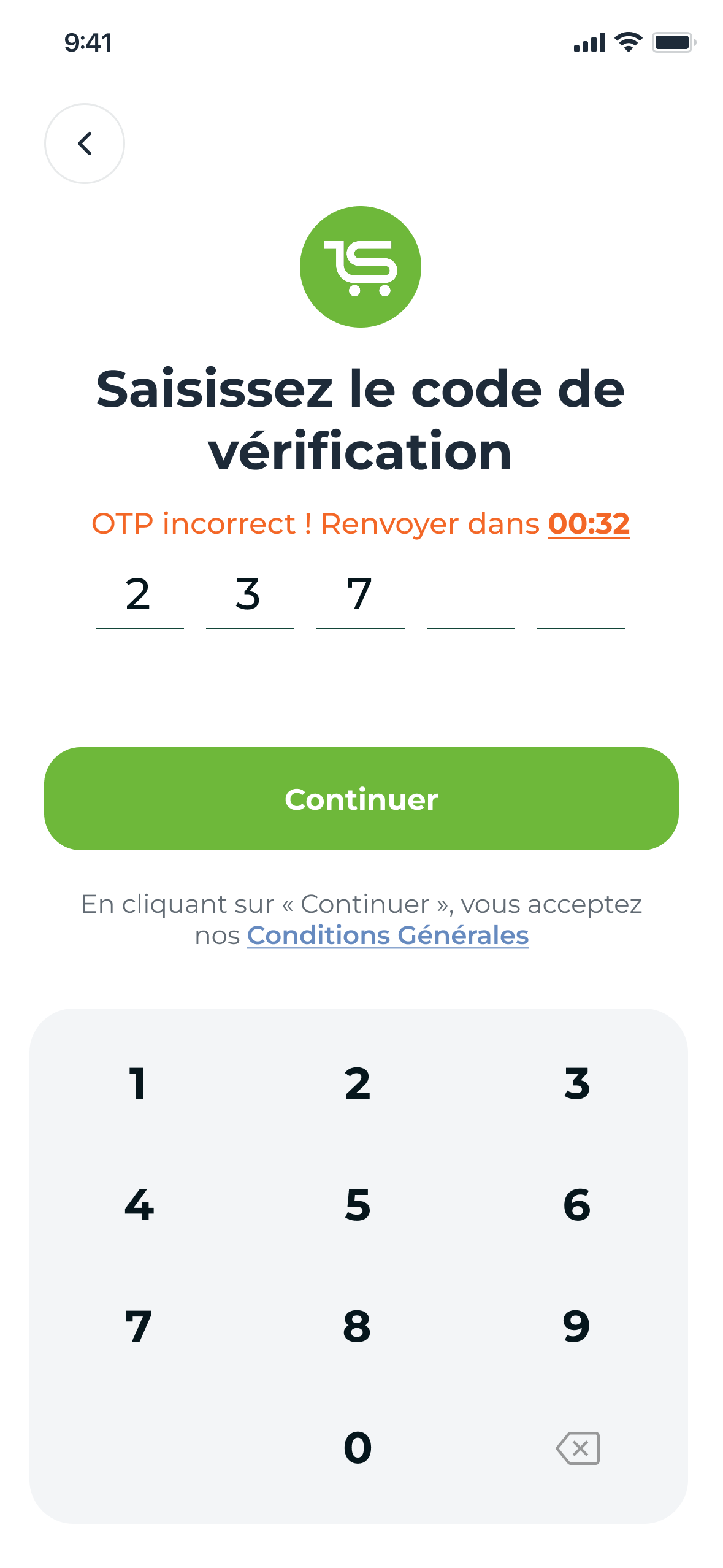
The same error in French: Saisissez le code de vérification, OTP incorrect, renvoyer dans 00:32

Fig. 07 — The wrong-code state, English and French

Edge states

08 — When the shop says no


Every error says what went wrong, at the field, with one way on.
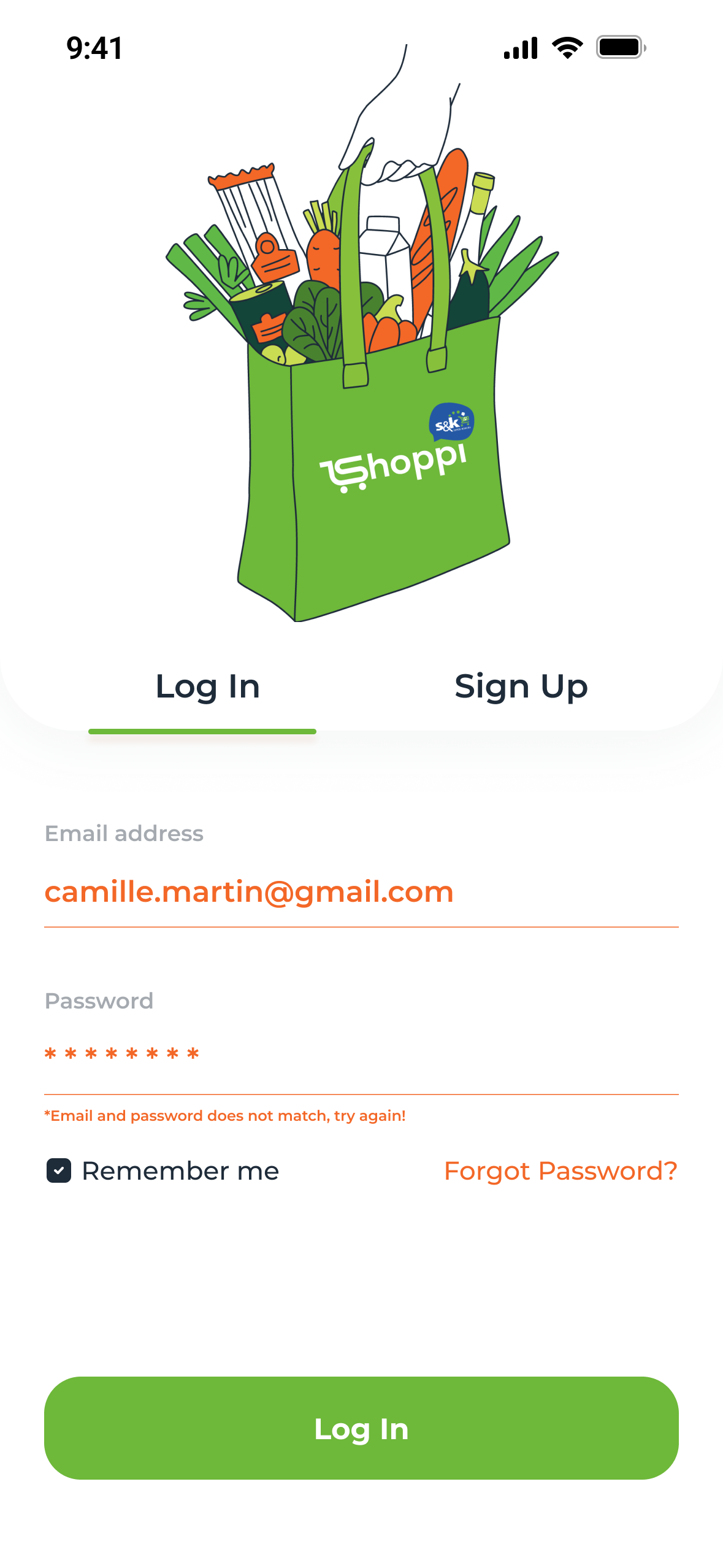
Log In with an error under the fields: the email and password don't match
Login — names the pair that failed
Sign Up with the password rules shown in red under the field
Password — rules at the point of failure
Add card with the card number in red and an error under it
Card — fails on the field, before payment
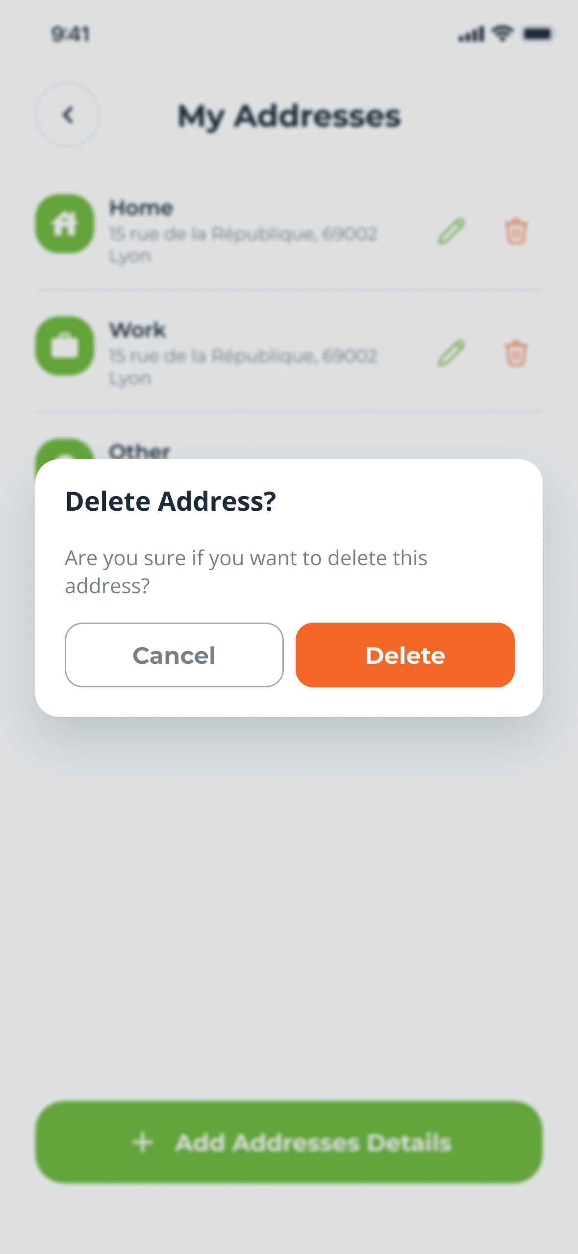
My Addresses with a Delete Address? dialog: Cancel and a red-orange Delete
Delete address — confirmed first
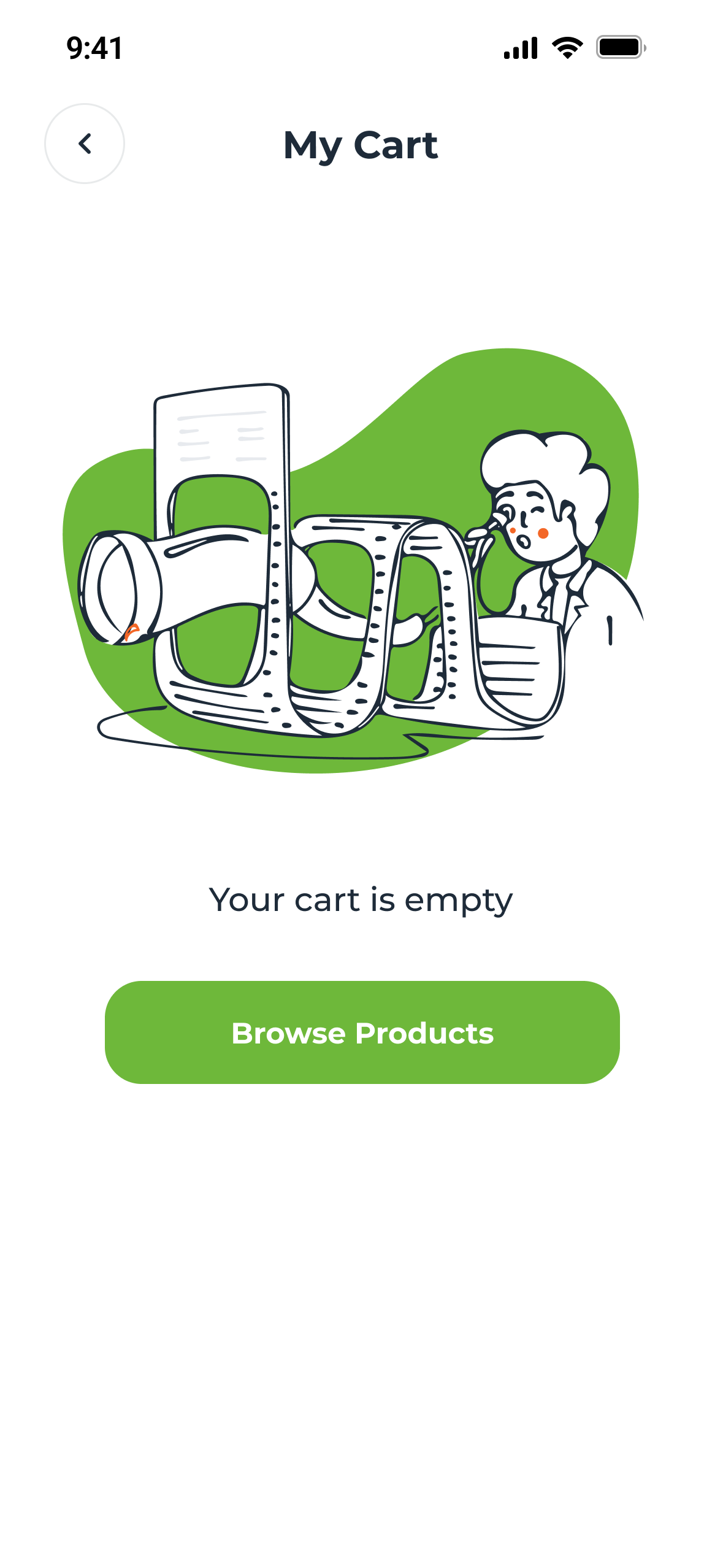
Empty cart: an illustration, Your cart is empty, and Browse Products
Empty cart — one way out
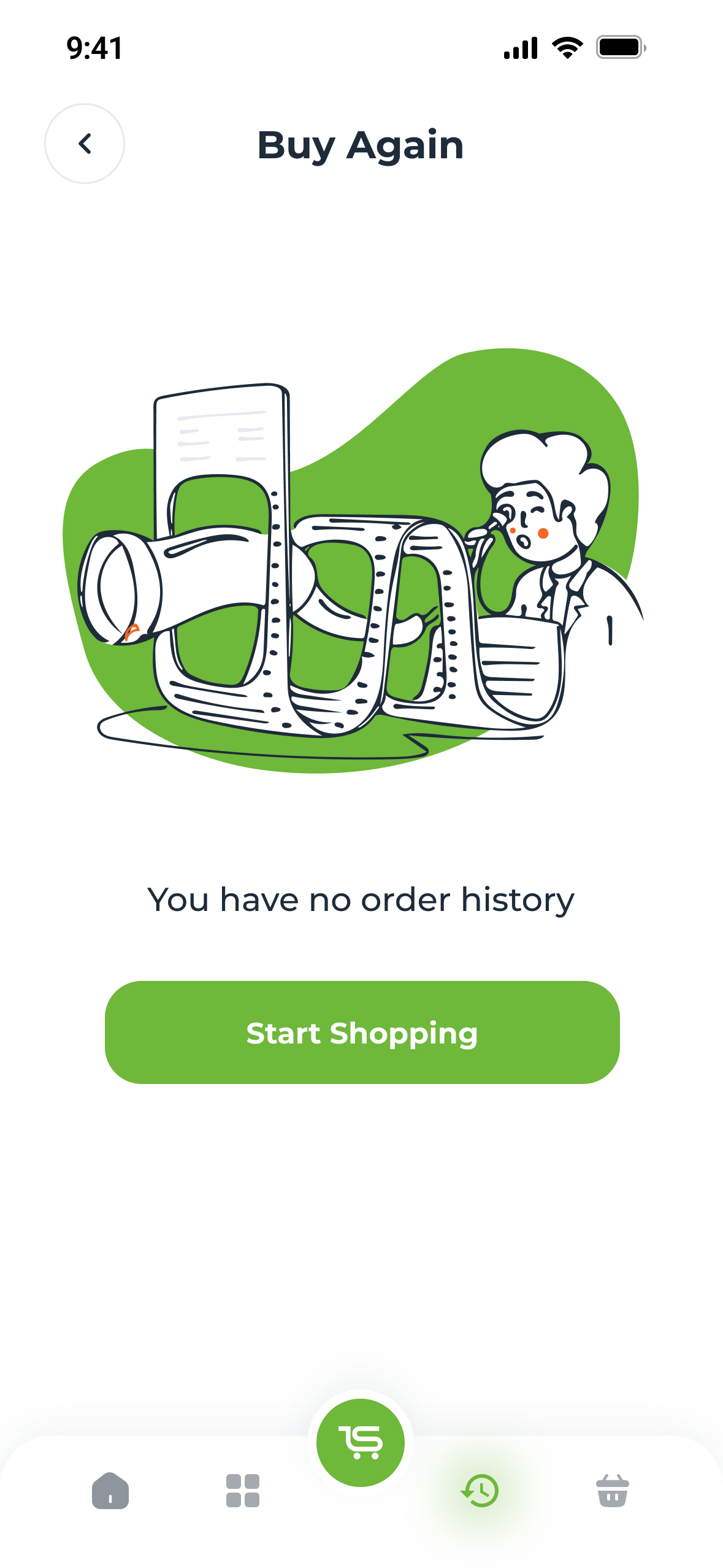
Buy Again with no history: an illustration, You have no order history, and Start Shopping
No orders yet — the same invitation
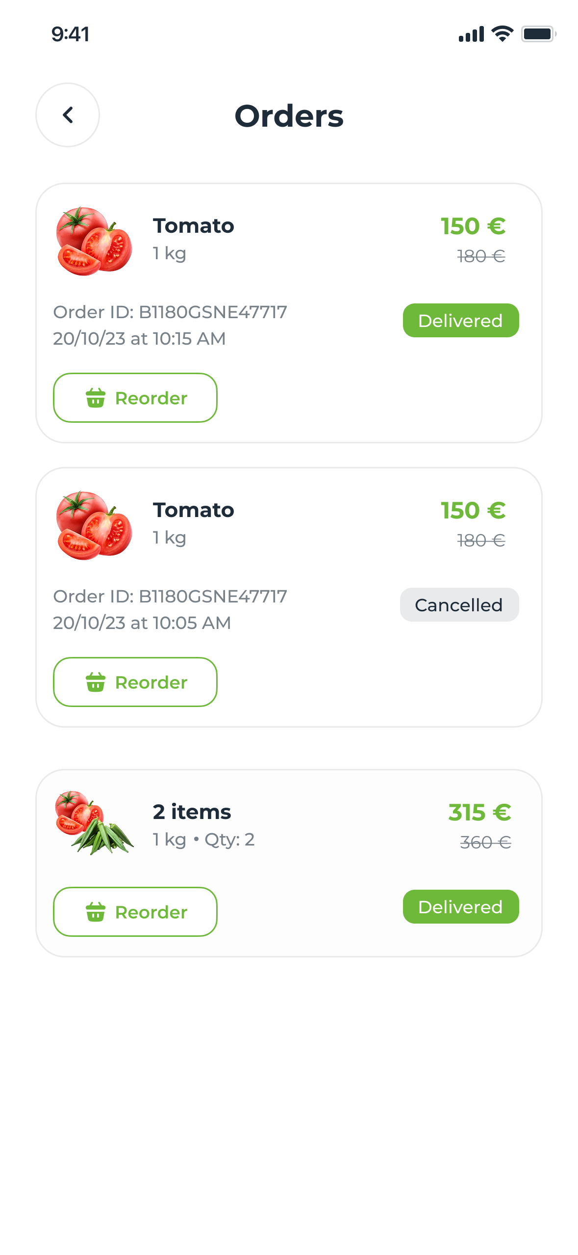
Orders: past orders with their IDs and dates, one Cancelled, each with Reorder
Cancelled — Reorder stays
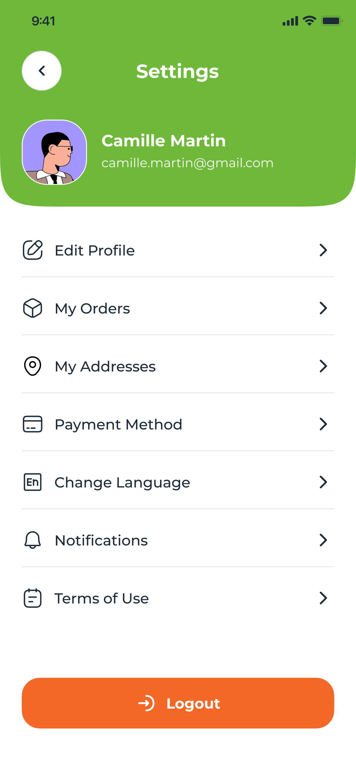
Settings: profile, then Edit Profile, My Orders, My Addresses, Payment Method, Change Language, Notifications, Terms of Use, and an orange Logout
Settings — Logout set apart, in orange

The system

09 — Colour and type


Fresh green does the selling; everything else stays quiet.

Typeface

Montserrat Regular to Bold, with the French accents

Weights

4 roles Body, labels, product names, prices

Colour

  • Leaf #6EB83A · actions, prices, savings
  • Ink #1E2B39 · text
  • Mist #E9EEF6 · header ground
  • Carrot #F36727 · change, delete
  • Lime #CADC52 · campaign accent
  • White #FFFFFF · surface
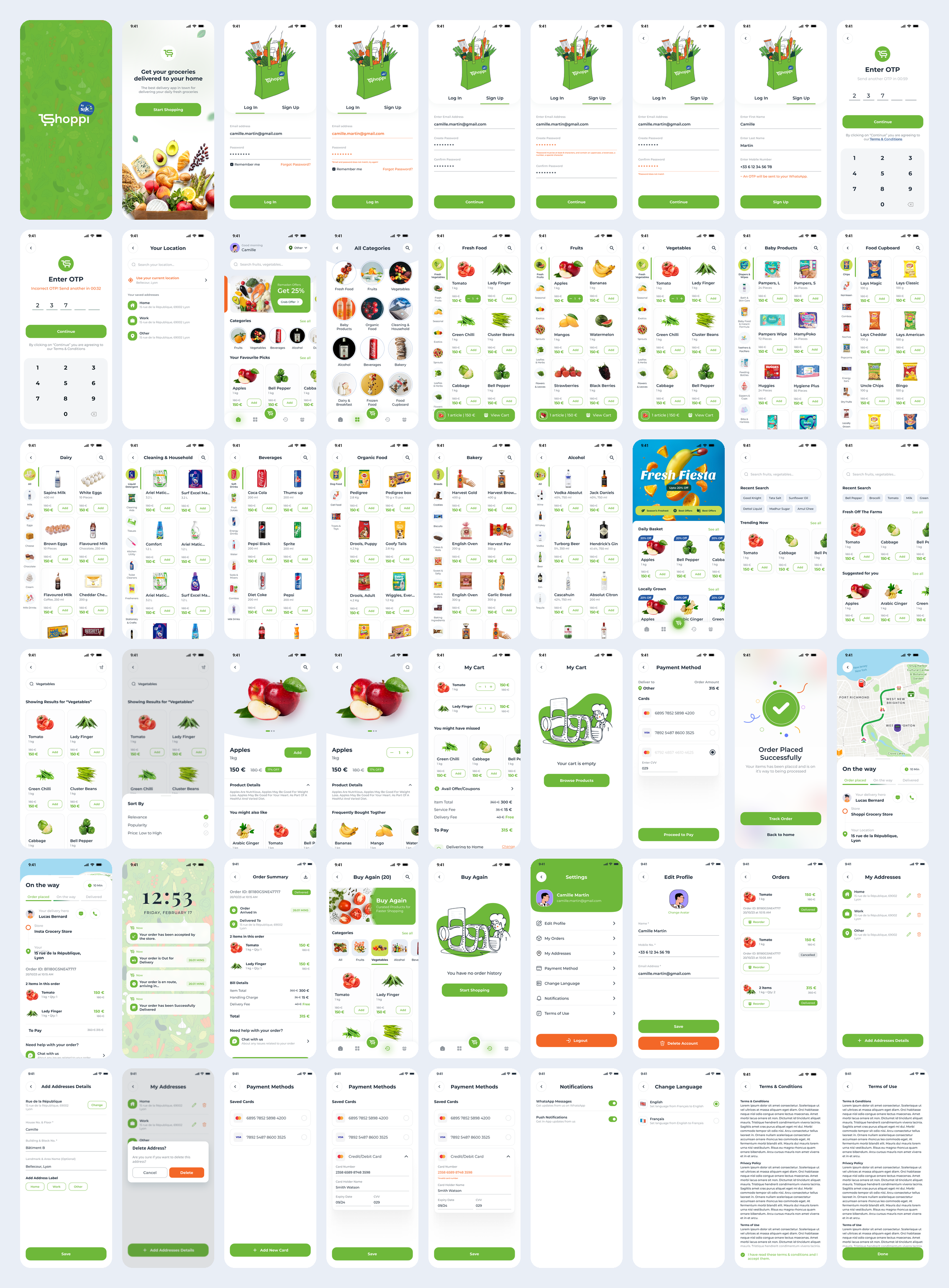
All 54 English screens on one board, from the splash screen to terms of service
The file — 54 screens in English
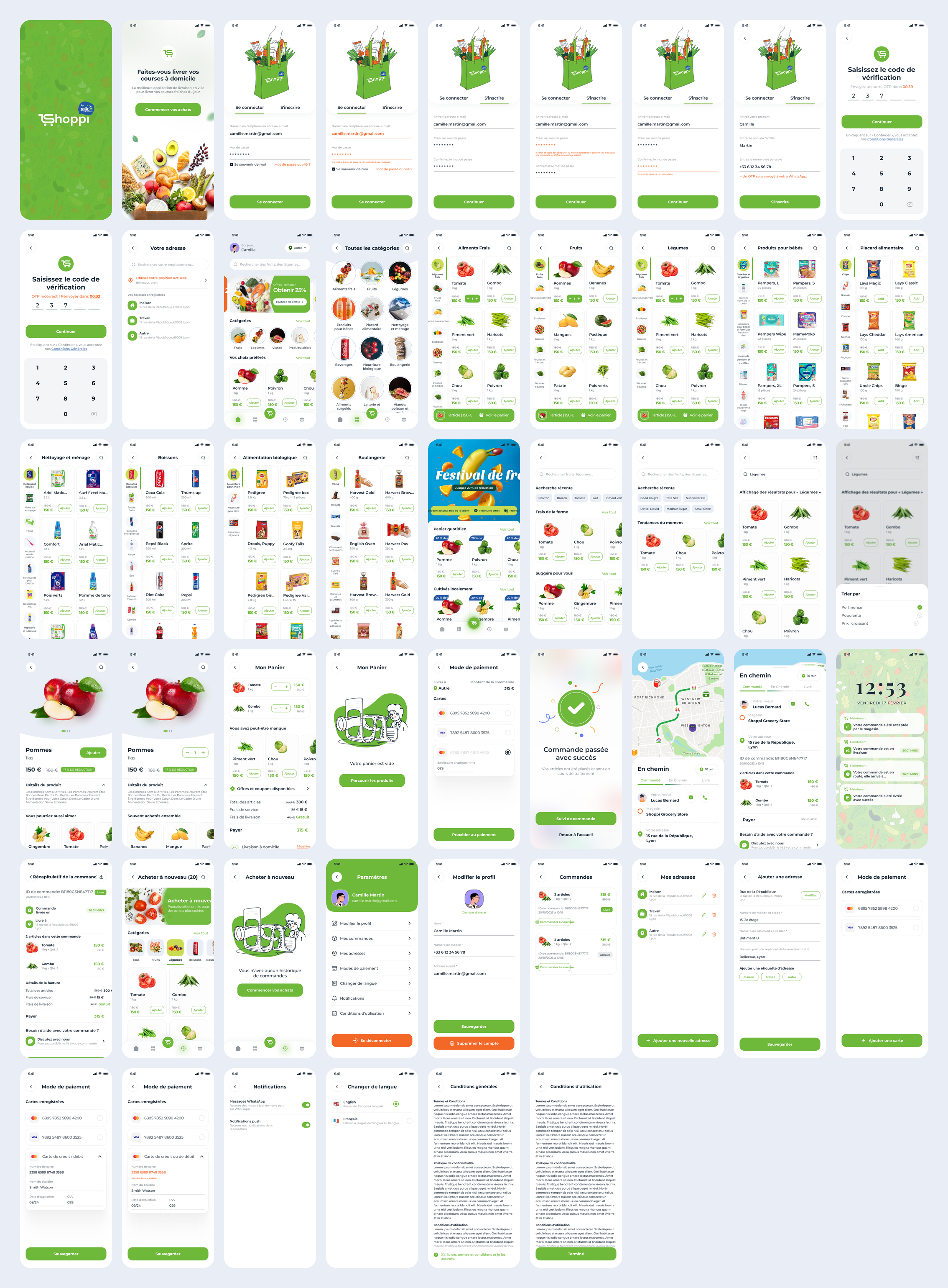
All 51 French screens on one board, in the same order
The file — 51 in French

Trade-offs

10 — Four calls


Four calls, and what each one cost.

01

OTP over WhatsApp, not SMS

GainedCodes land in an app people keep open.

CostA hard dependency for anyone without it.

02

The bill inside the cart

GainedNo late surprises; the saving sits beside the spend.

CostA longer cart that scrolls on small phones.

03

A sub-category rail, not nested menus

GainedOne screen for a whole aisle.

CostNarrower cards, so names truncate sooner.

04

A named rider

GainedThe wait feels accountable; problems go to chat.

CostNeeds reliable live location from operations.

What I’d do differently

11 — The second pass


What the second pass would fix.

French QAA string audit on every French frame: “Beverages” and one aisle’s “Add” slipped through.

One name per feeThe cart says Service Fee, the summary Handling Charge. A content glossary would have caught it.

ContrastWhite on the leaf green measures 2.45:1. Keep the green for fills; darken it for text and prices.

Real dataReal prices and a real Lyon map would surface layout problems earlier than 150 € everywhere.