All work

Case study 03 — Healthcare / End-to-end / 4 weeks in Figma


A reminder that works when the user doesn't.

Remedi is a medicine reminder app for people who frequently forget their medications — and for the people who love them. Its parental feature distinguishes it from everything else on the market: you can track and remotely assist loved ones who find apps like this difficult to use, and find acclaimed pharmacies and clinics nearby.

Role
UI/UX Designer — end-to-end
Duration
4 weeks
Domain
Healthcare / caregiving
Tools
Figma, user interviews

Two failure modes, one app

01 — Problem


Some people find it difficult to learn new apps in an ever-expanding digital environment — and people forget things more easily than ever, prescriptions included. The combination is brutal: the users who most need a reminder app are often the least served by one.

The goal: a basic, easy-to-use app so users never miss a schedule, can find pharmacies and clinics nearby — and can be guided through the app by their loved ones when needed.
Remedi app shown across three phone screens
Fig. A — Remedi

One-on-one interviews, four consistent signals

02 — Research


  1. Users want to keep track of medication regimens and appointments in one place

  2. Users want their devices and apps to be simple to use — complexity is a dealbreaker, not a feature

  3. Users look for well-regarded hospitals, pharmacies, and clinics in their vicinity

  4. Users want to manage and track the schedules of their loved ones, not just their own

Jenny Atlas, 31 — Engineer, married, 2 kids


“I don't want work to impact my family's health.”

Goal: one well-organised place for the whole family's medicine requirements.

Frustration: tracking everyone's schedules, forgetting to restock the cabinet, missing appointments on stressful days.

Aurther Wilde, 63 — Retired


“I'm too old to track schedules, but I don't want to bother my daughter.”

Goal: a better quality of life without becoming a burden.

Frustration: forgets prescriptions through the day; today's complex mobile apps are unusable for him.

These two personas define Remedi's core tension: the app must serve Jenny's need for control and Aurther's need for simplicity — simultaneously, in the same product.

Architecture first, then pixels

03 — Design


I mapped the information architecture and user flows before touching UI, keeping depth of navigation to a minimum so every core task — set alarm, add medicine, find a clinic, check on a loved one — is reachable in a couple of taps. Low-fidelity wireframes organised the work; usability findings fed straight back into the structure.

The visual layer pairs Montserrat with a calm palette of mint-teal and soft lavender — deliberately gentle for a product that lives next to health anxiety. The working prototype was tested with users to validate that the flows matched what people actually wanted.

  • Home

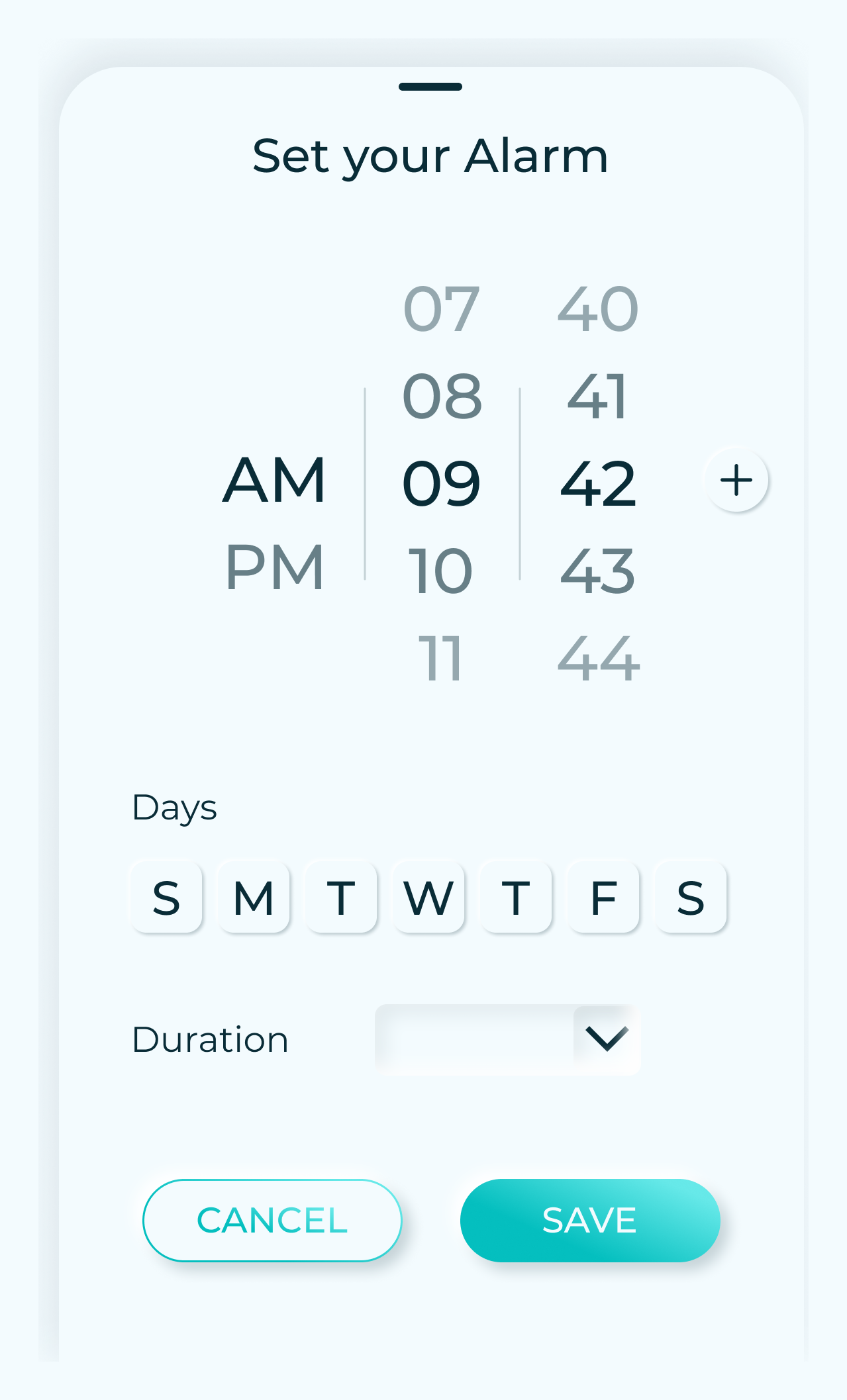
    • Set Alarm
    • Add Medicine
      • Edit Medicine
      • Search
  • Appointments

    • Add Appointment
    • Search
  • Nearby

    • Clinics
      • Hospital
      • Pharmacy
  • Parental

    • Monitored Accounts
      • Scan
      • Medicine
      • Appointments
      • Search
  • Account

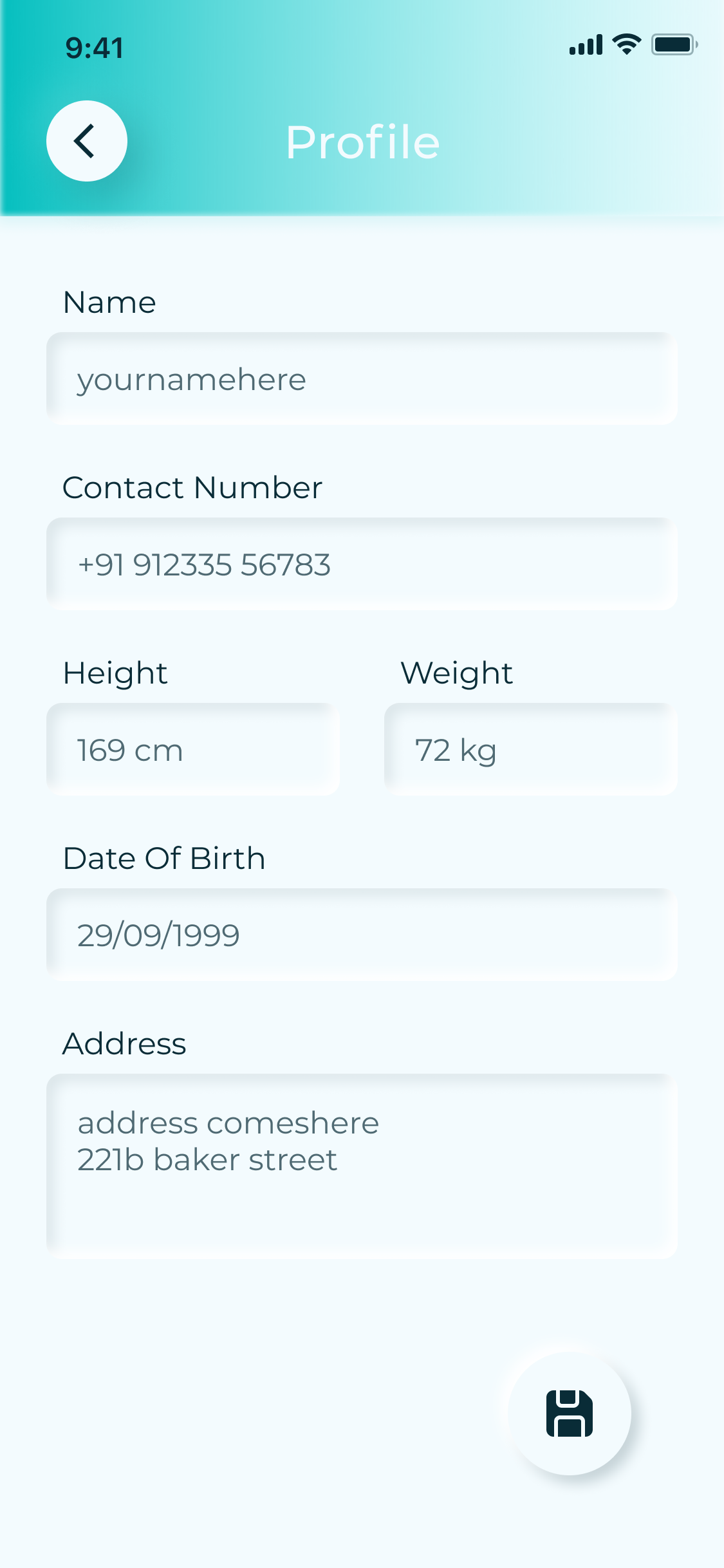
    • Profile
    • Access Code
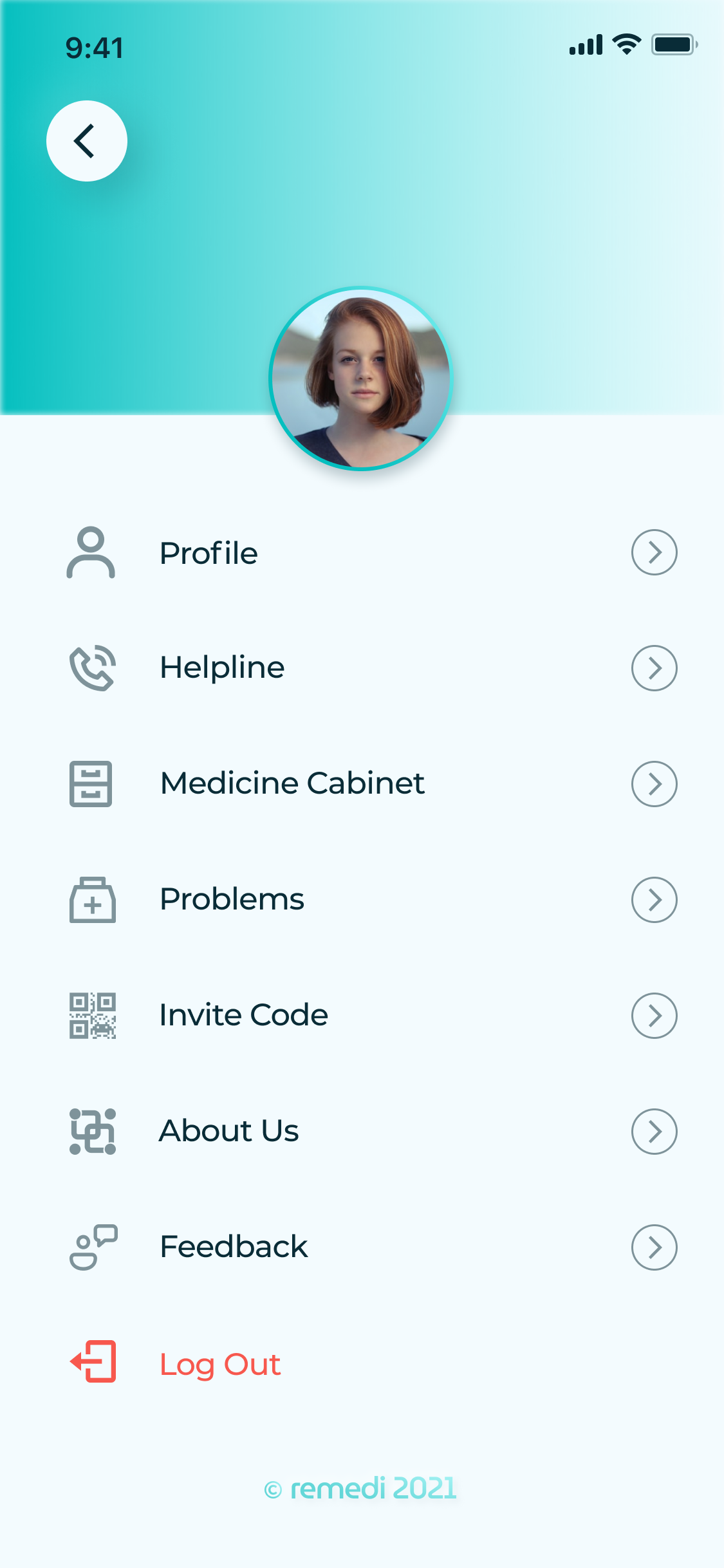
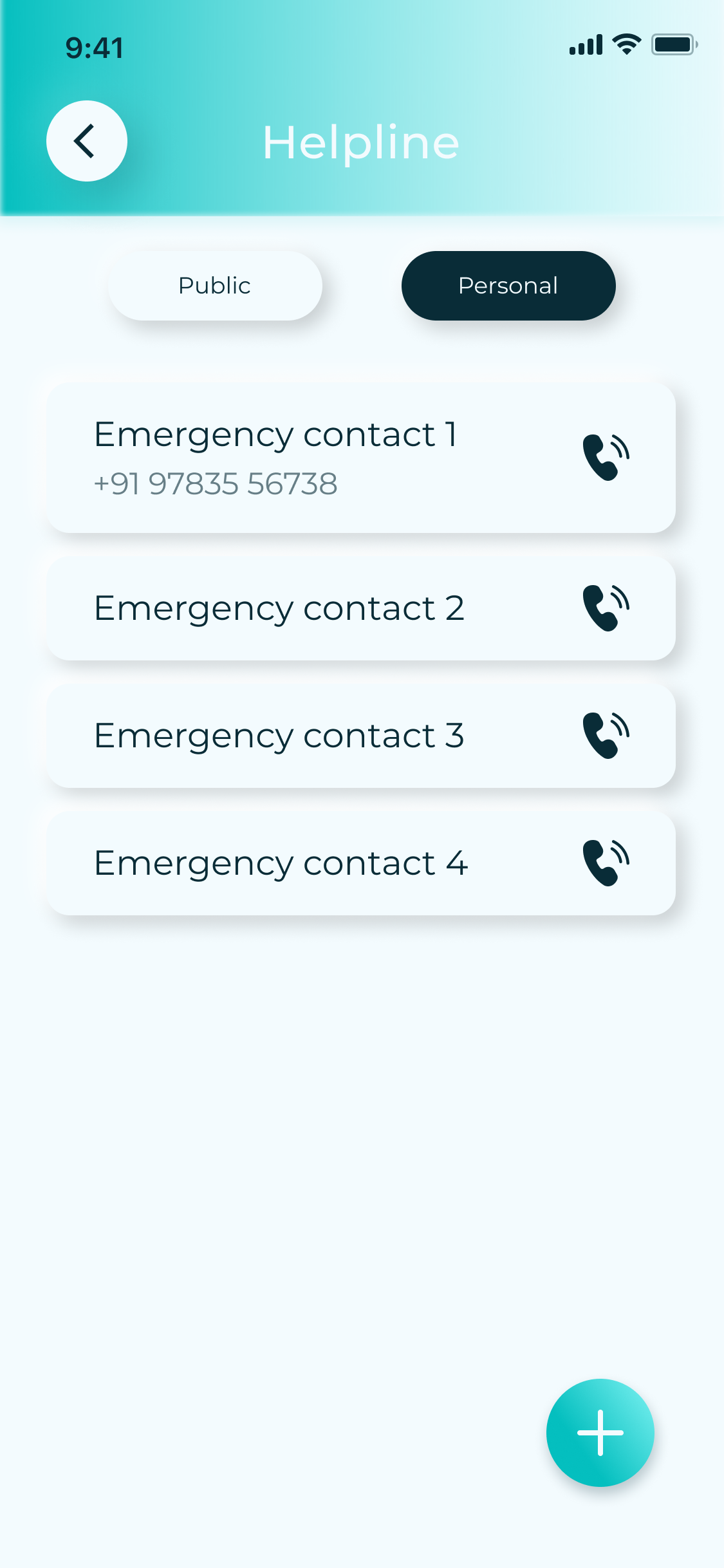
    • Helpline
    • About Us
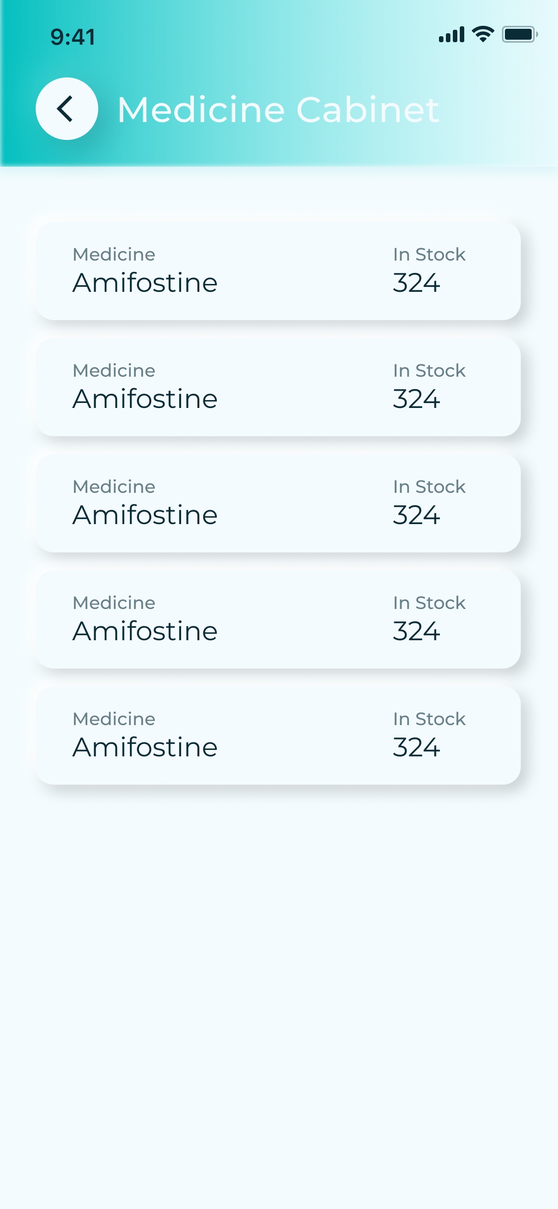
    • Medicine Cabinet
    • Feedback
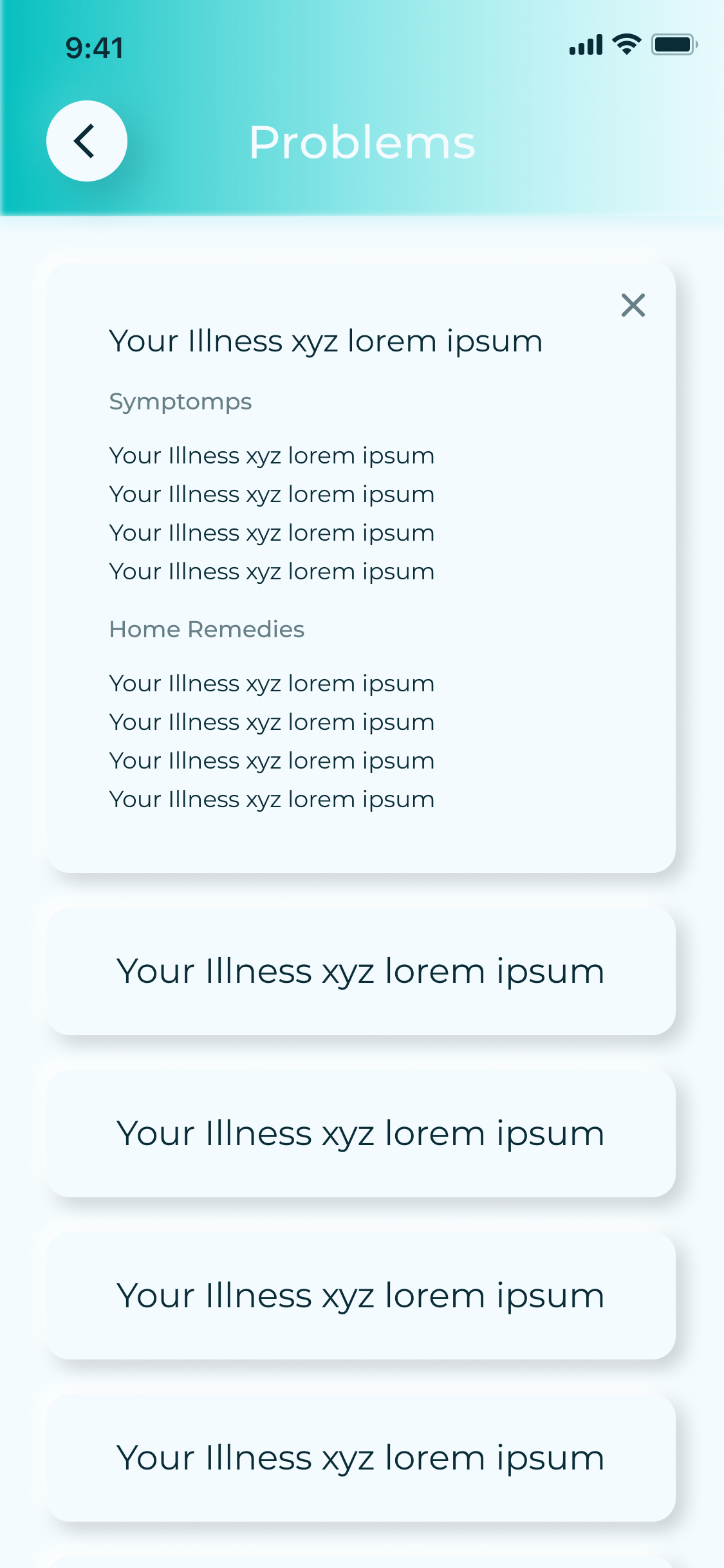
    • Problems
    • Log out
Fig. B — Information architecture & navigation map
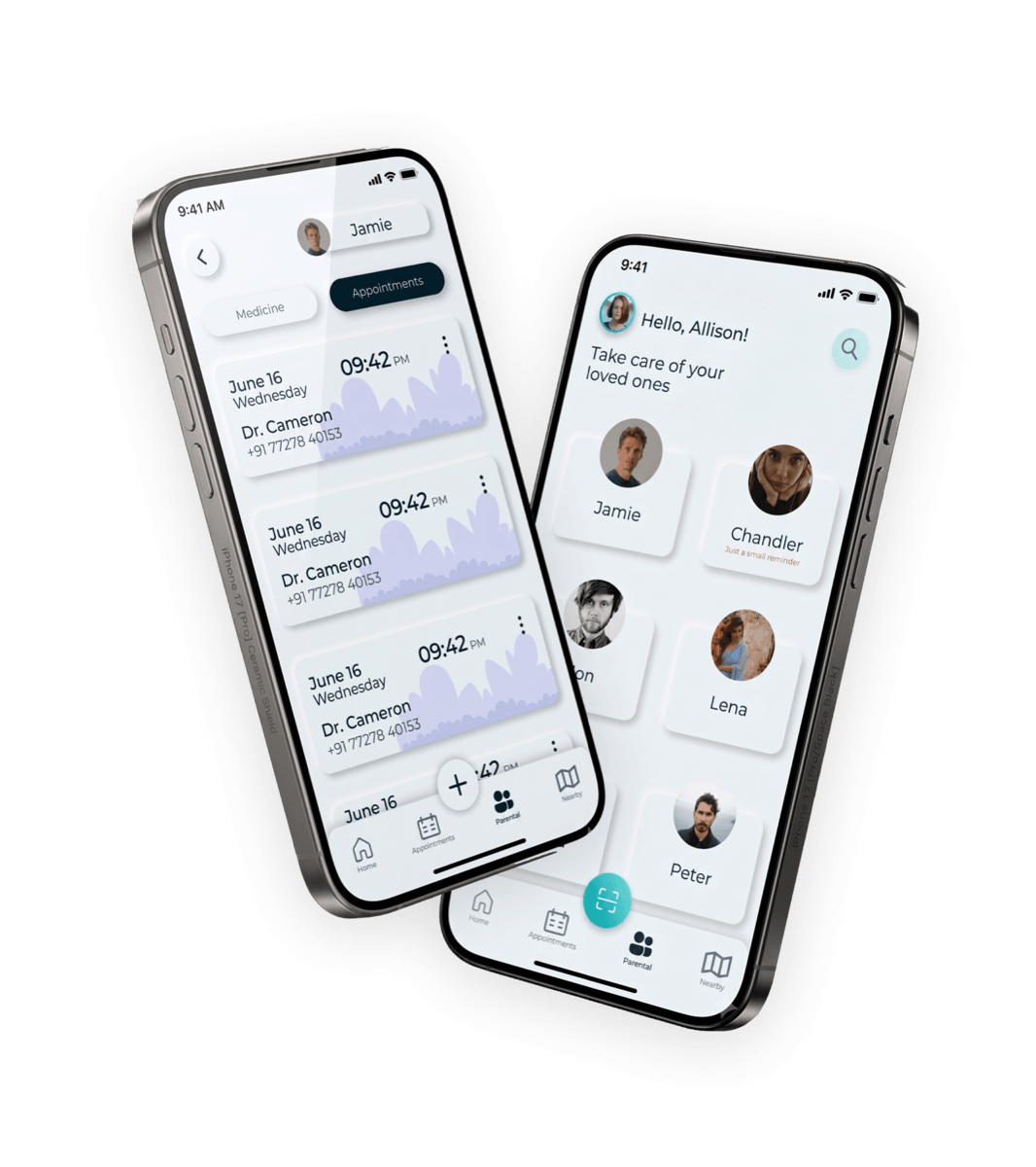
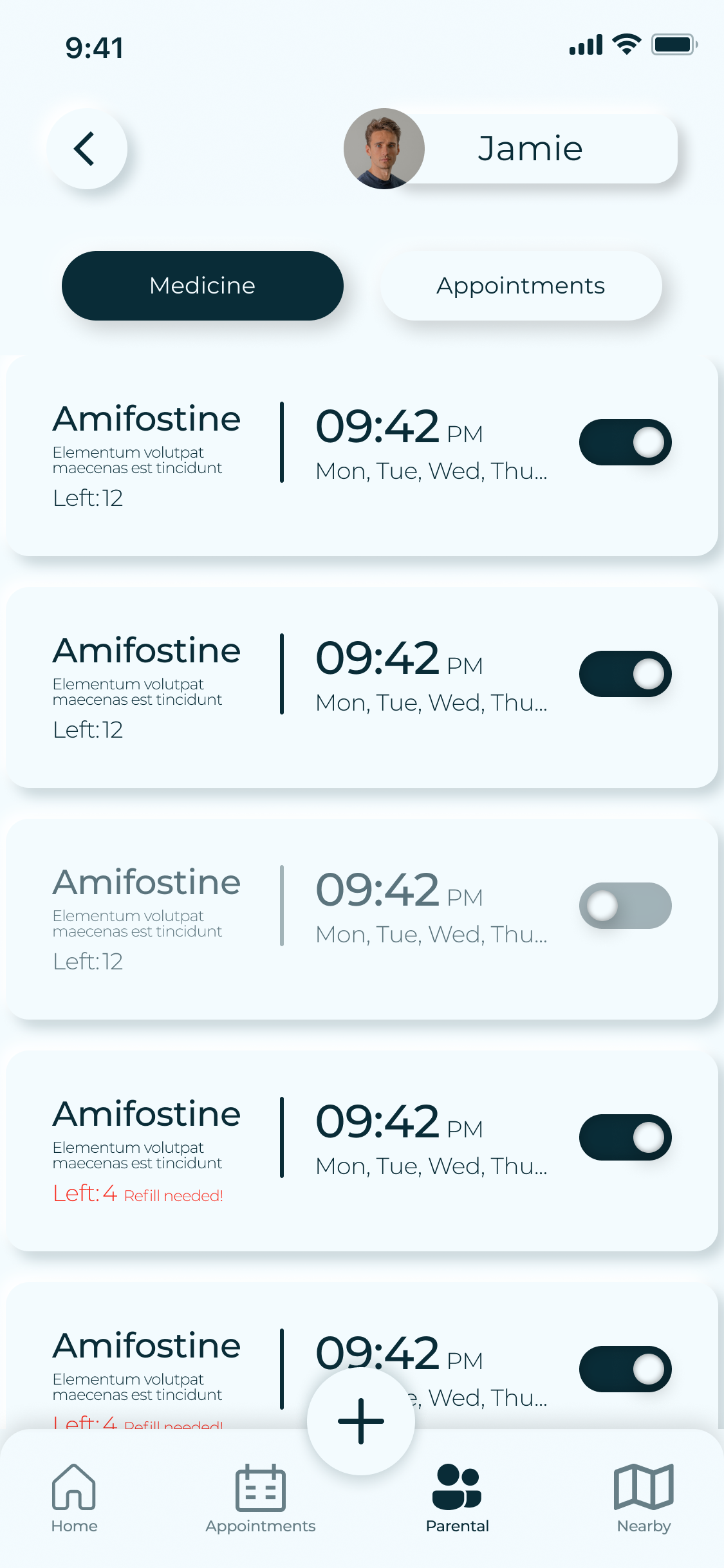
The Remedi parental feature: a caregiver viewing and managing a loved one's medicine schedule remotely
Fig. C — The parental feature: remote assistance for loved ones

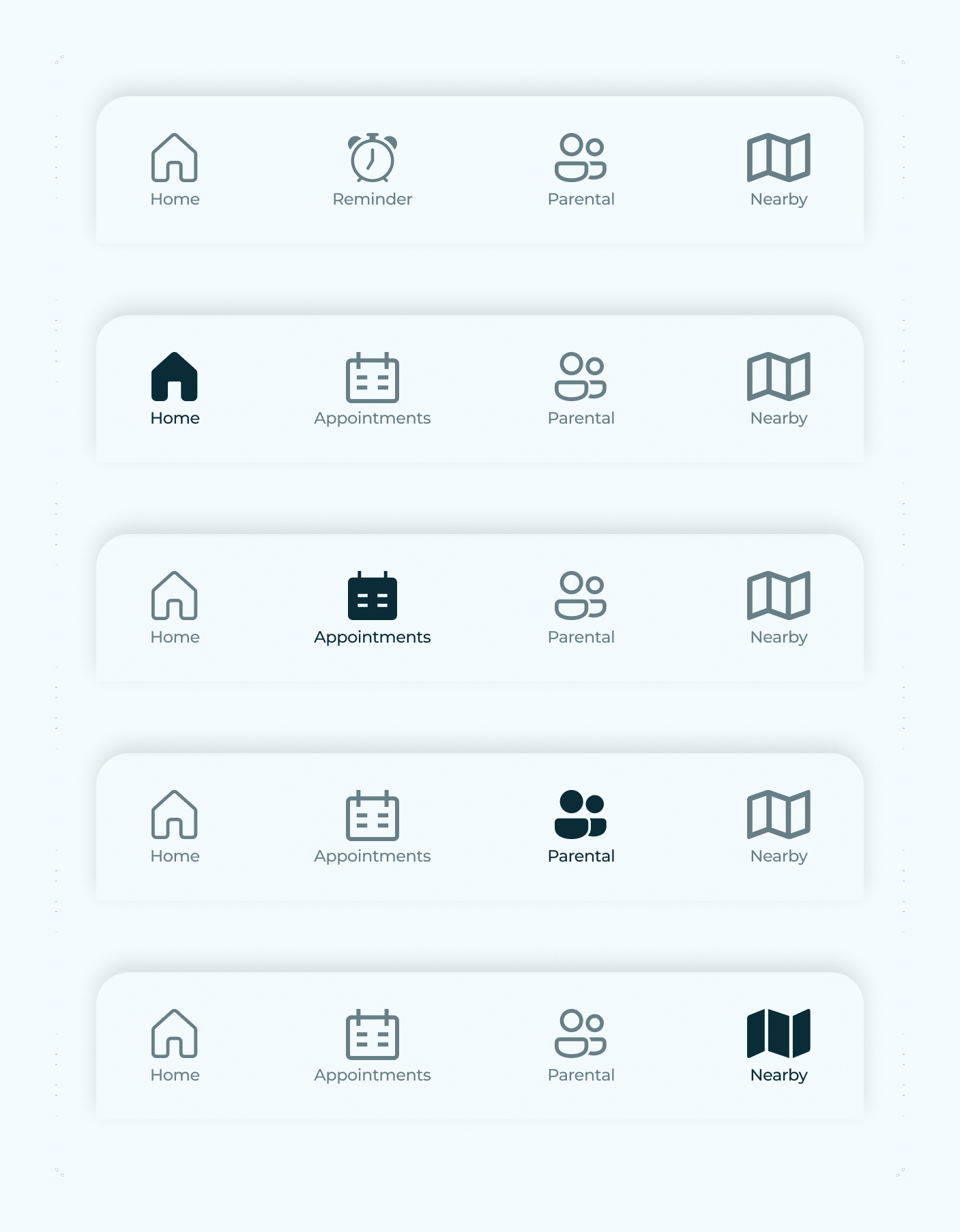
Four tabs, one job each

04 — The product


Navigation stays flat and predictable. Every core task lives one tap from the bottom bar — no nested menus, no hunting.

Home


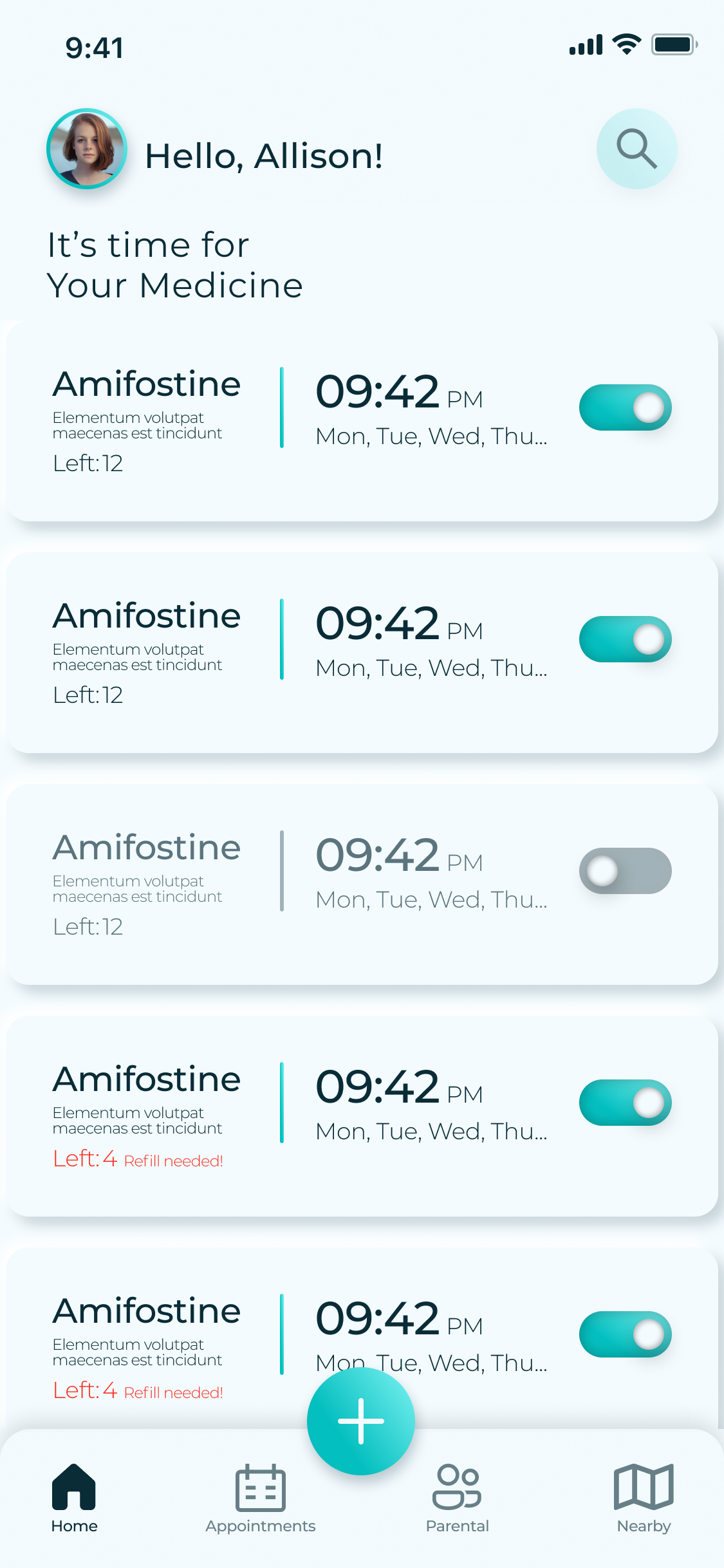
“It's time for your medicine”

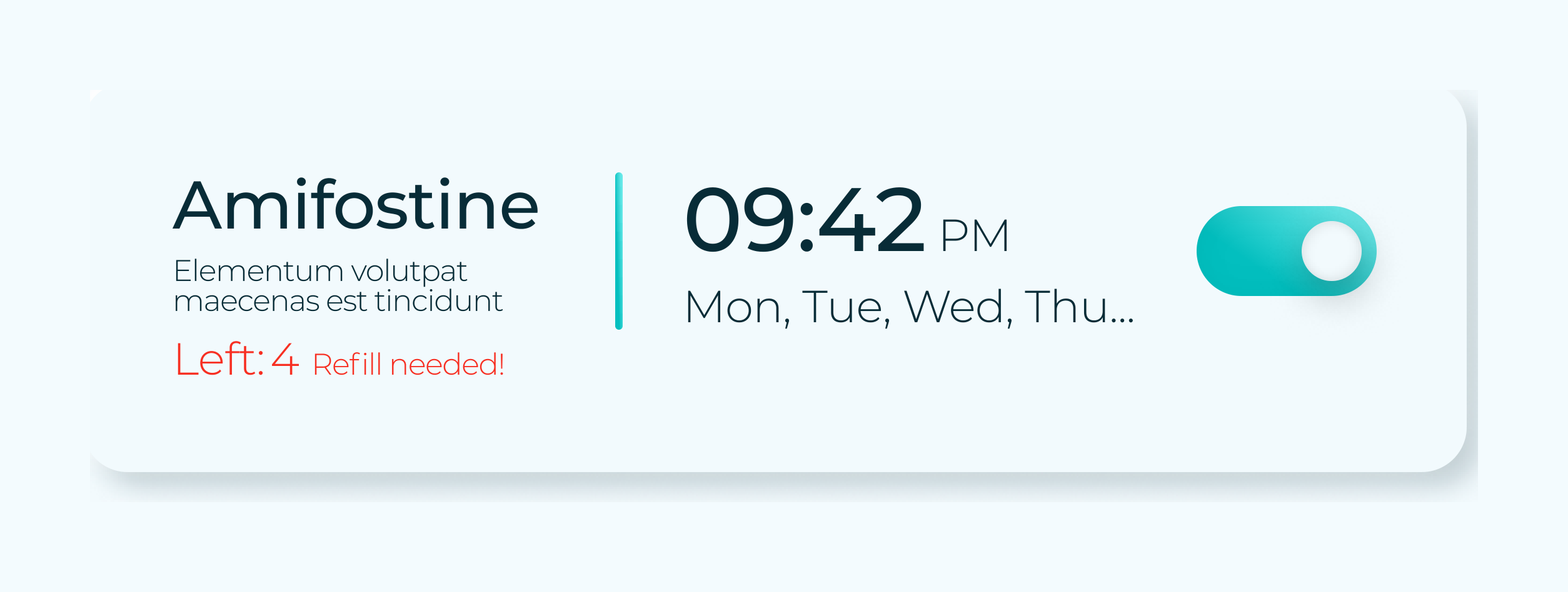
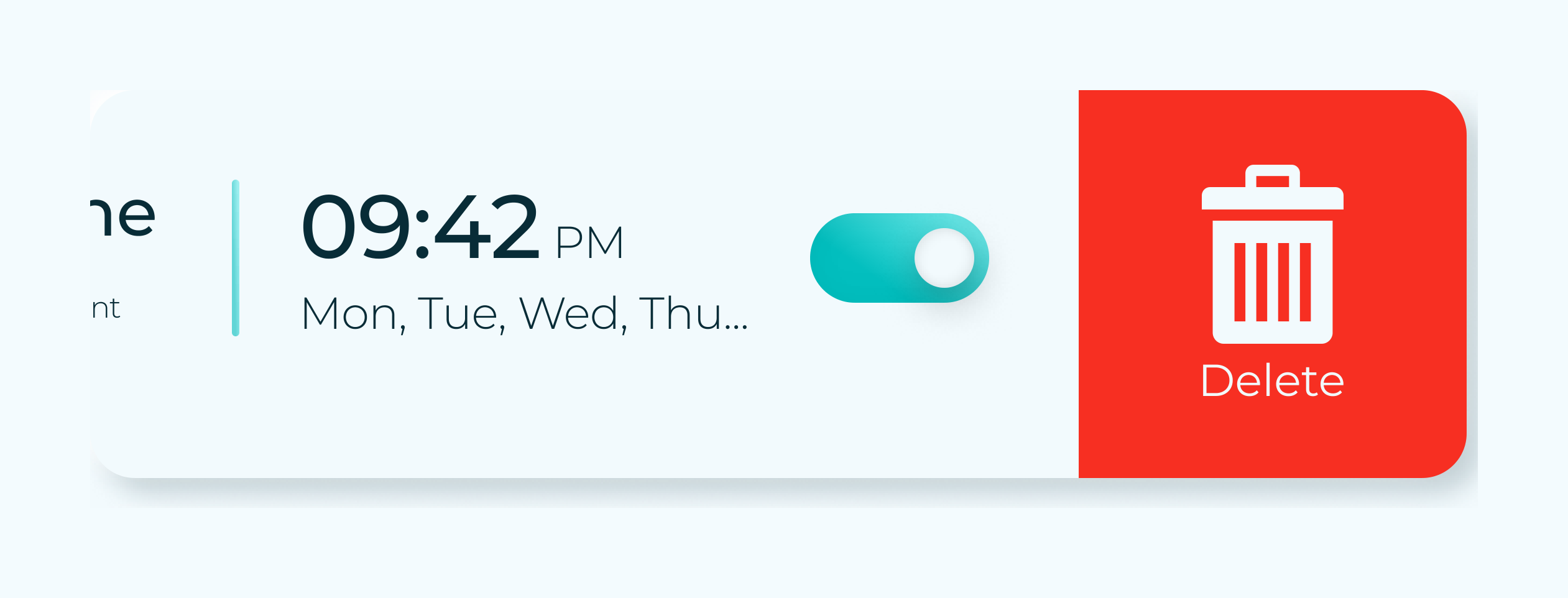
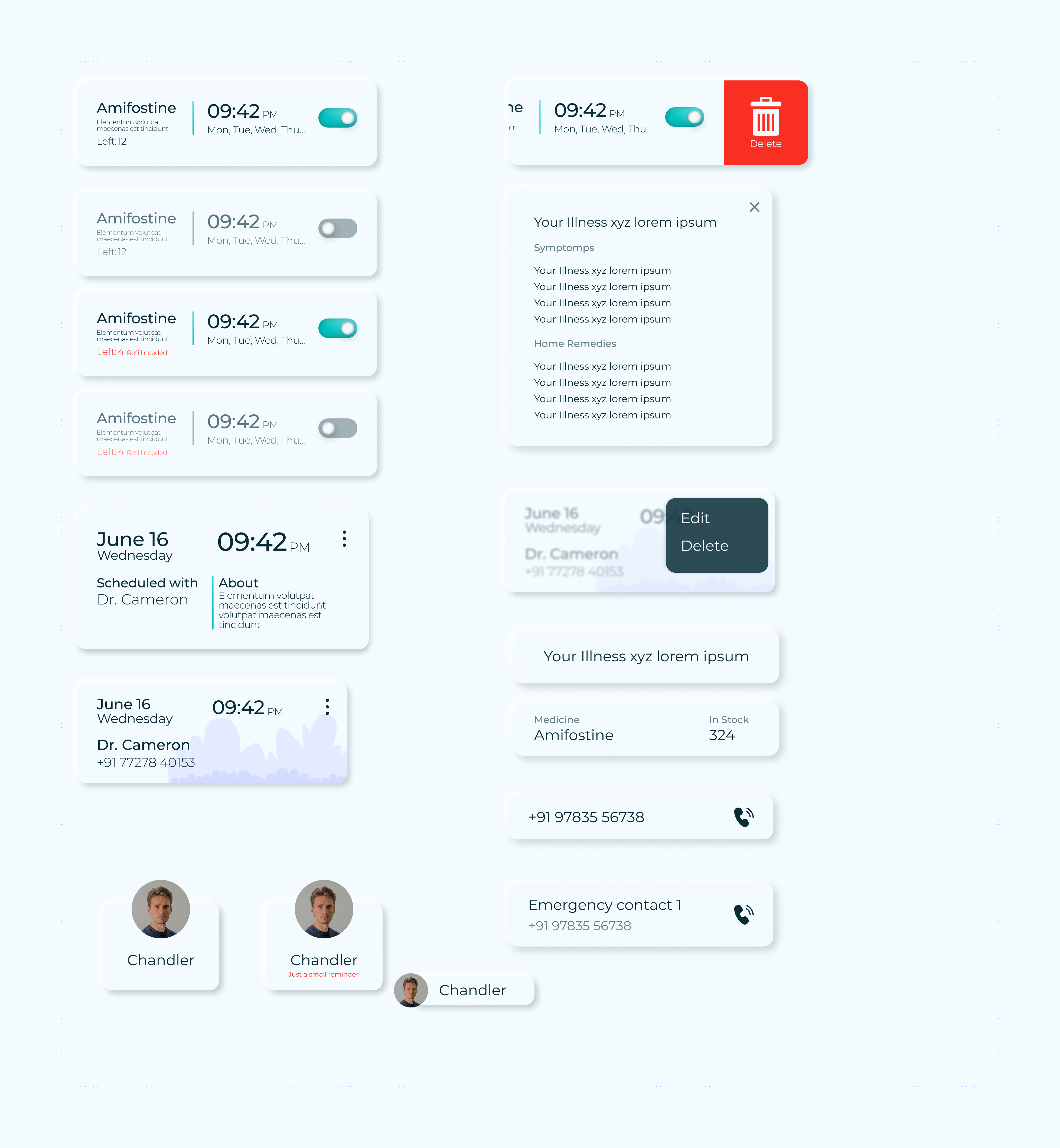
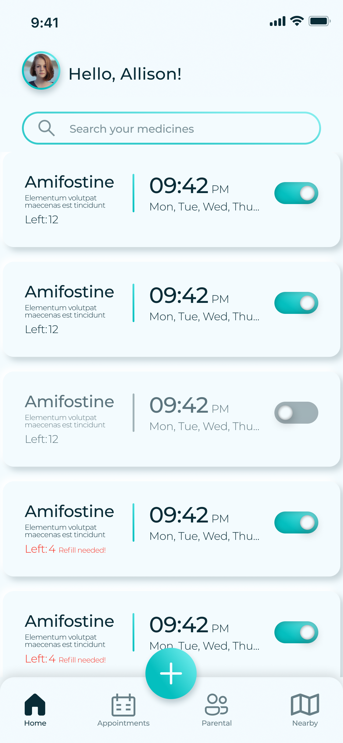
Each medicine is a card with its dose time, days, and a single on/off toggle. A running Left: 12 count flips to Refill needed! before a user runs out.

Appointments


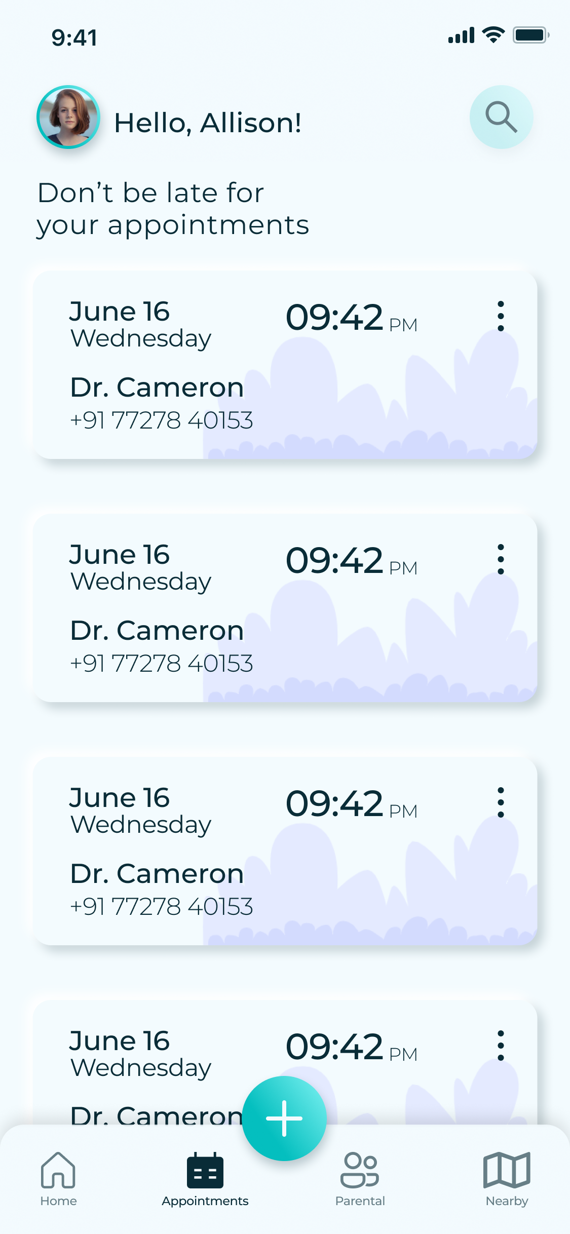
“Don't be late”

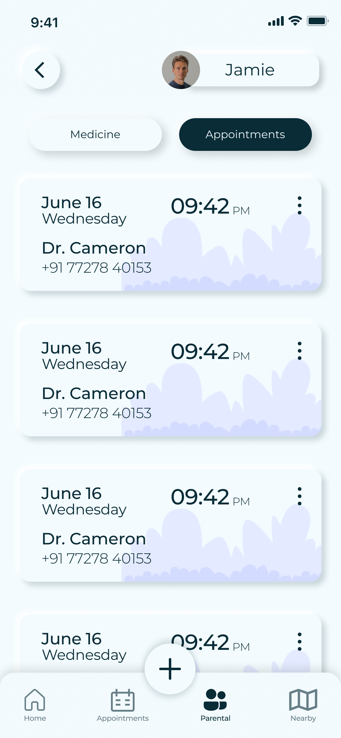
Upcoming doctor visits, each with date, time, and a one-tap call to the clinic — medication and appointments finally in one place.

Parental


“Take care of your loved ones”

A grid of the people you look after. Tap in to see their medicine and appointments, and get nudged when someone needs a small reminder.

Nearby


Well-regarded, close by

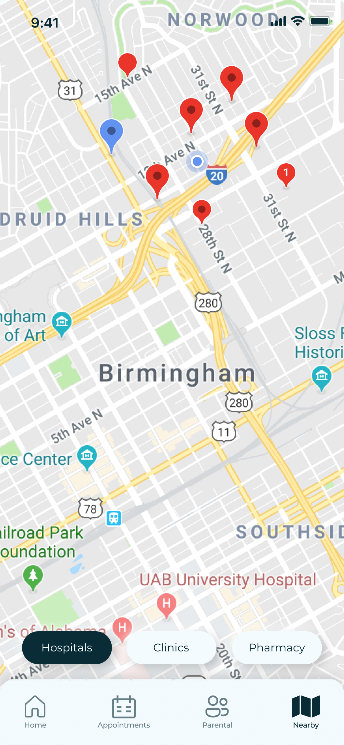
A map of acclaimed pharmacies and clinics in the user's vicinity — the fourth research signal, built straight into the tab bar.

Remedi core screens: the set-alarm sheet, the reminders list, and the parental view
Fig. D — Set-alarm sheet, reminders & the parental view

Choices that served both personas at once

05 — Decisions


  1. One toggle per medicine. Managing a whole schedule is a single tap — no forms, no confirmation dialogs to get lost in.

  2. Inventory that warns early. The dose counter turns into a red “Refill needed!” well before zero, so no one is caught out mid-course.

  3. Oversized type, generous targets. Large numerals and roomy hit areas keep the app usable for older users like Aurther without a separate “accessible” mode.

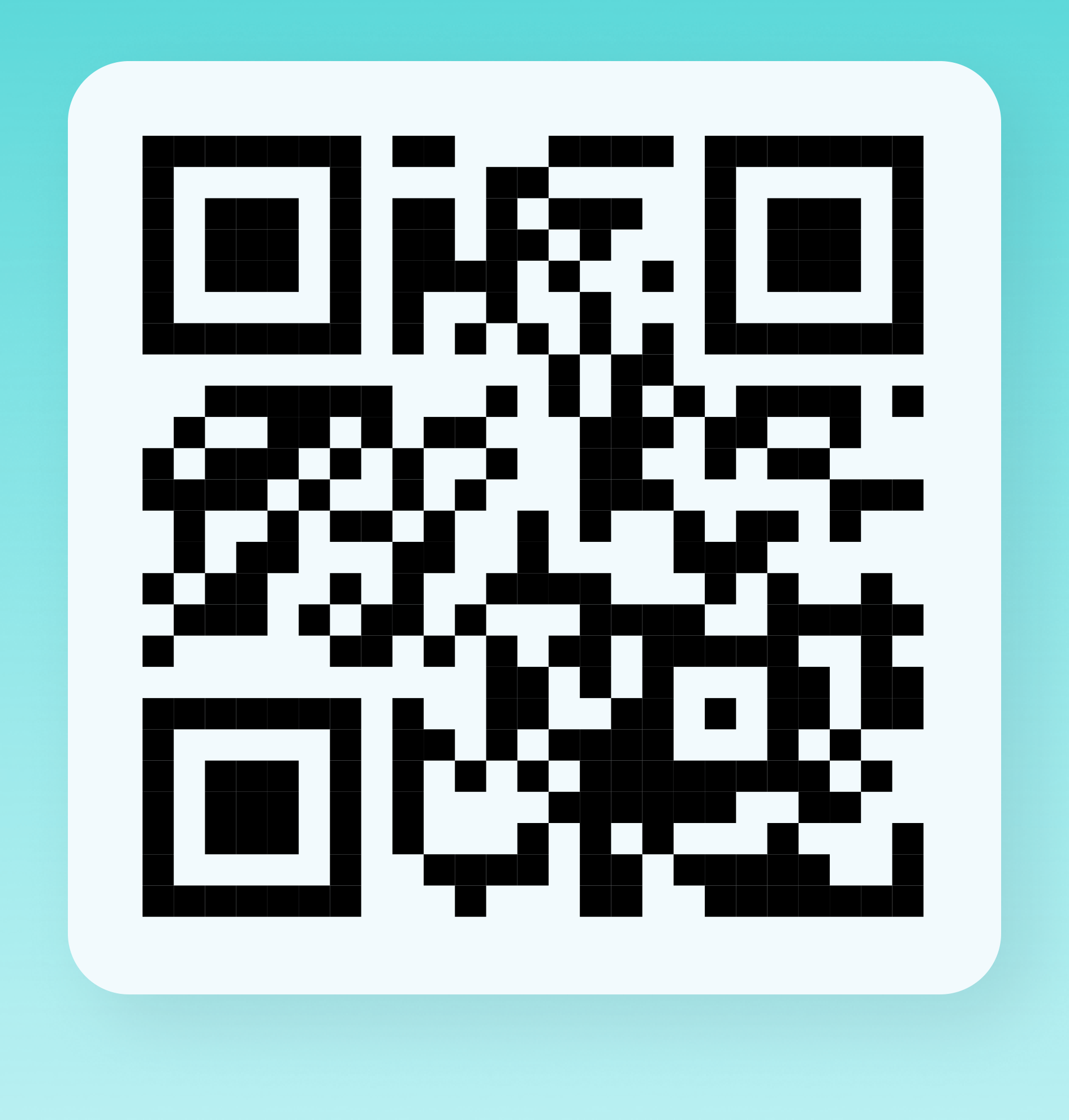
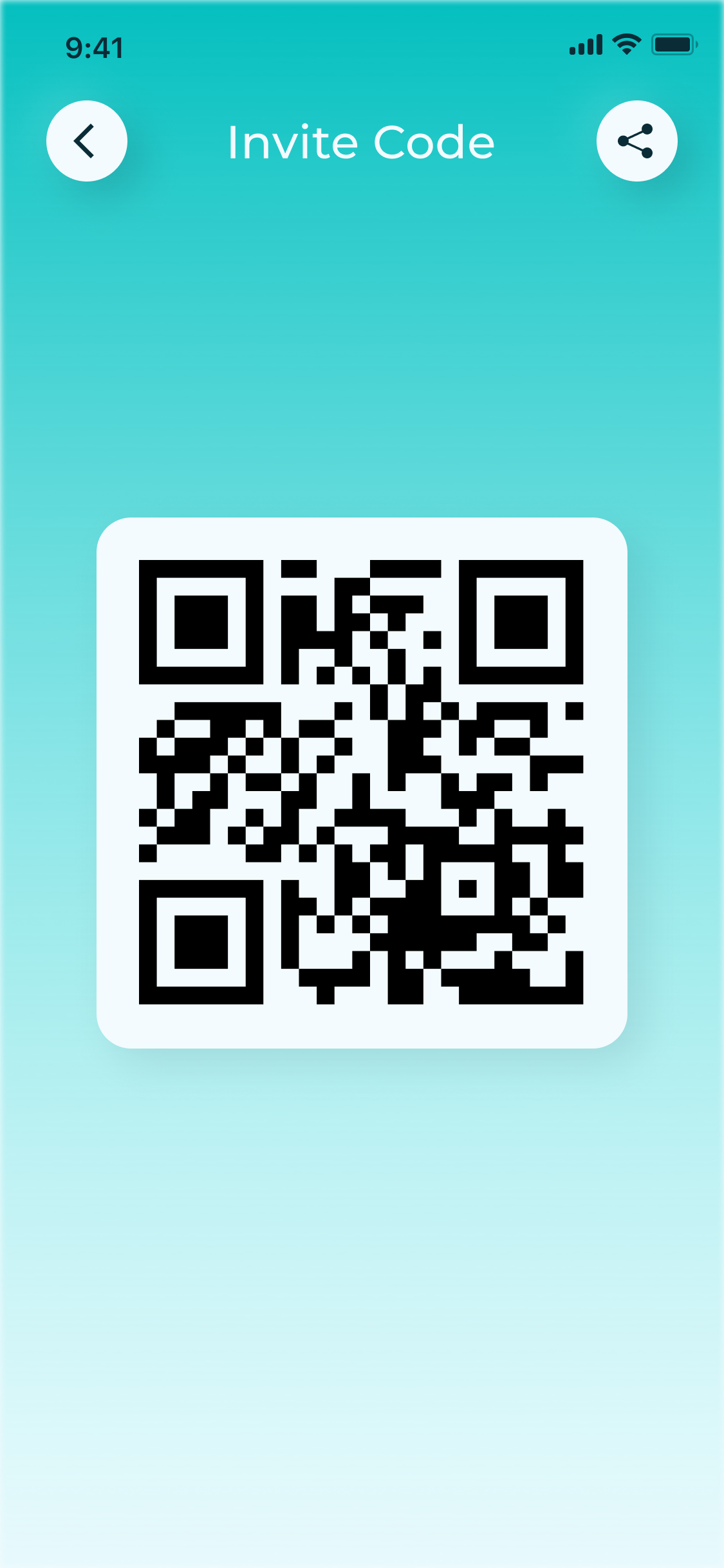
  4. Pairing by QR, not setup. A caregiver adds a loved one with a single scan — the tech-averse user never has to configure anything themselves.

I designed this for my grandmother

06 — Why it's personal


I forget my own medication sometimes — that's where the idea started. But the parental feature exists because of my grandmother, who can't use a smartphone at all. With Remedi, my sister or I handle her reminders remotely. The most important flow in this product is the one that runs when the primary user does nothing — because for some users, doing nothing is the default.

Also on Behance

07 — Companion board


A visual companion to this page — board layouts, additional screens, and the research artefacts in presentation form — is posted on Behance.

View the Behance board


Next — 03 / Building in public

Lumen — EV charging