All work

Case study 01 — Flagship / Lead role


The product page that stopped leaking carts.

A comprehensive overhaul of Firstcry.com's Product Details Page — and, underneath it, a new, modern design system for the Middle East market. As the leading UI/UX designer, I owned the entire design lifecycle: research and strategy through high-fidelity prototyping and implementation reviews with developers.

Role
Leading UI/UX Designer
Scope
PDP redesign + bilingual design system
Market
Middle East — UAE & KSA
Team
PMs, developers — continuous loop

Four problems compounding on one page

01 — Challenges


Outdated aesthetics. The visual design was no longer competitive — dated against contemporary e-commerce, hurting brand perception with a generation of users who expect modern, intuitive interfaces.

Inconsistent experience. Without a unified design system, visual and functional inconsistencies had spread across sections and product categories, undermining trust and making navigation unpredictable.

Poor usability. Friction in the key interactions — viewing details, selecting variations, adding to cart — was producing frustration, high bounce rates, and incomplete purchase journeys.

Competitive disadvantage. Noon, Namshi, and Mumzworld were offering more modern, seamless shopping experiences and pulling users away.

The redesigned Firstcry product details page shown across devices

Discover, define, design, deliver

02 — Process


Discover. Aligned on mission, scope, and KPIs with product managers; quantitative analysis of existing product data to locate friction points.

Define. Synthesised the data into pain points, built personas and empathy maps to capture users' emotional and functional state, and formulated clear problem statements.

Design. Wireframes → design system → interactive prototypes, with usability testing measuring success rates, task time, and error rates.

Deliver. Post-testing refinement, implementation reviews for design and accessibility standards, and monitoring A/B test results with the development team.

Research with PMs showed the majority of users prioritize fresh, minimal, and interactive design — the market had moved; the page hadn't.

01


Discover

Align on mission, scope & KPIs. Quantitative analysis of product data to locate friction.

02


Define

Synthesise into pain points. Personas, empathy maps & sharp problem statements.

03


Design

Wireframes → system → prototypes. Usability testing on success, time & error rates.

04


Deliver

Refine, review for a11y standards & monitor A/B results with the dev team.

Fig. — The four-phase process

Where the old PDP was losing

03 — Competitive analysis


A comparison across regional and global platforms established best practices and made the gap measurable:

Competitive comparison across seven PDP dimensions and four platforms
DimensionOld FirstcryNoonNamshiMumzworld
Aesthetics NoYesYesNo
Product visuals NoYesYesYes
PDP navigation NoYesNoNo
Information structure NoYesYesNo
Mobile UX NoYesYesYes
Trust signals NoYesNoYes
Variant selection NoNoYesNo

Four parents, four different definitions of “good”

04 — Users


Empathy mapping went a level deeper than demographics — what each parent says, thinks, does and feels on the page. Designing for a stressed mother on a lunch break and a sceptical engineer comparing warranties is not one design problem, it's four. Each card below is a research readout: the verbatim that defined the segment, the emotional state we designed against, and the behaviour it drove.

Working mother

Sarah

32 · Mobile-first60-second checkout

“If I can't check out in 60 seconds, I'm going to miss my meeting.”

Emotional state

  • Stressed
  • Impatient
  • Frustrated by lag

Pain

Slow loads, hidden buttons, tiny touch targets, checkout friction.

Goal

Speed, delivery reliability, visual proof of quality.

On the pageHunts for a fixed, high-contrast CTA at the bottom of the screen; skips detail, fills only what's required.

Father · Engineer

Omar

35 · Desktop researchSpec-driven

“I don't care about the cute photos. Just show me the dimensions and the warranty.”

Emotional state

  • Annoyed by fluff
  • Rational
  • Value-seeking

Pain

Vague copy, buried specs (weight, battery), hidden warranty.

Goal

Clear technical data, long-term value, manuals.

On the pageSearches keywords like ‘weight limit'; scrolls past marketing straight to Technical Specs and the user manual.

Expecting mother

Fatima

28 · First-timeSafety-obsessed

“Safety is non-negotiable — I need a clear badge to confirm certification.”

Emotional state

  • Overwhelmed
  • Highly cautious
  • Skeptical

Pain

No safety certs, vague materials, information overload.

Goal

Verifiable ratings, authentic reviews, clear specs.

On the pageOpens every accordion, zooms into images to read labels, and reads the Q&A before ever checking the price.

Stay-at-home mother

Amira

30 · Community-ledPeer-vetted

“I trust my peers more than the brand's glossy ads — show me real customer photos.”

Emotional state

  • Needs belonging
  • Peer-reliant
  • FOMO-prone

Pain

Generic stock shots, no community evidence, hard to share.

Goal

Real customer photos, genuine reviews, easy sharing.

On the pageJumps to reviews-with-images first, shares links to her mom group, and browses ‘frequently bought together' for validation.

Bilingual by design, not by retrofit

05 — The system


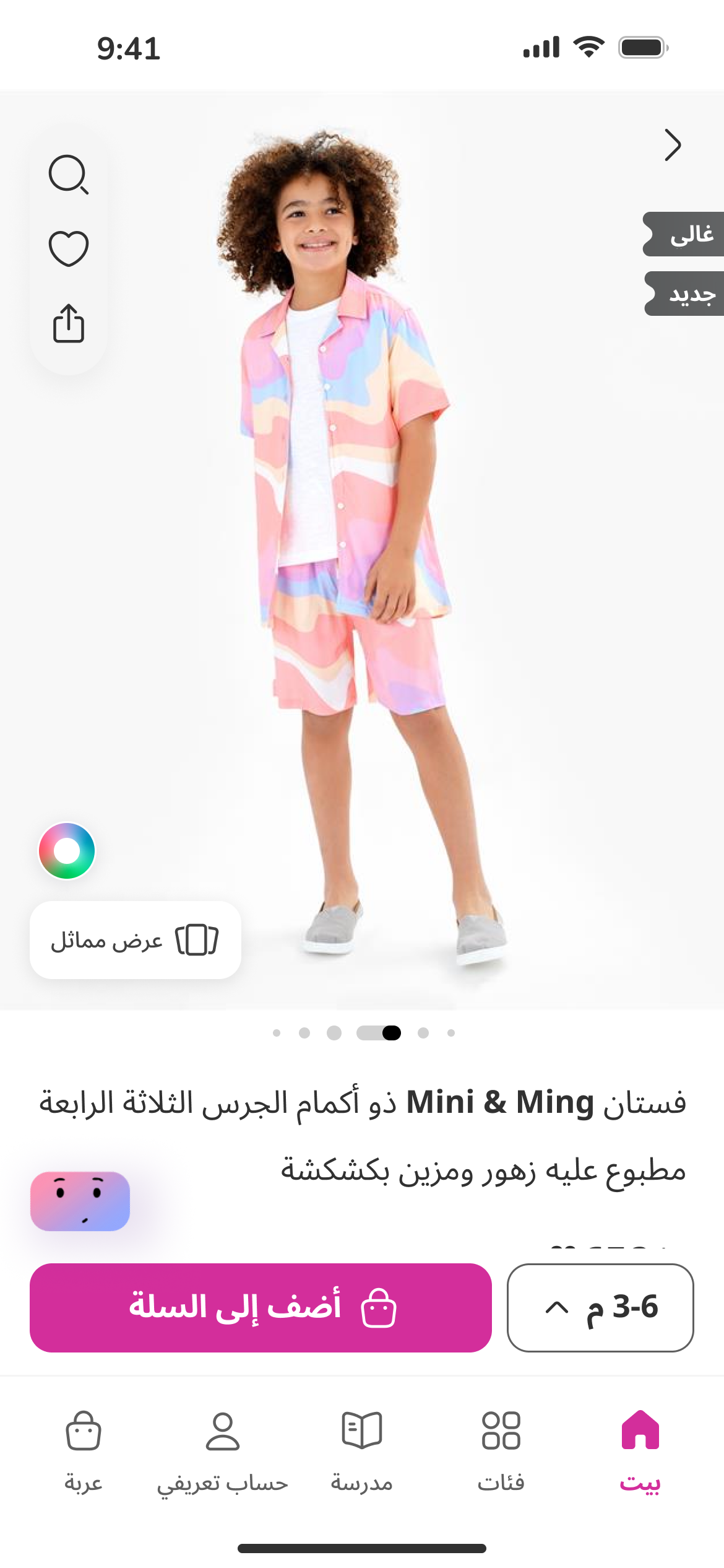
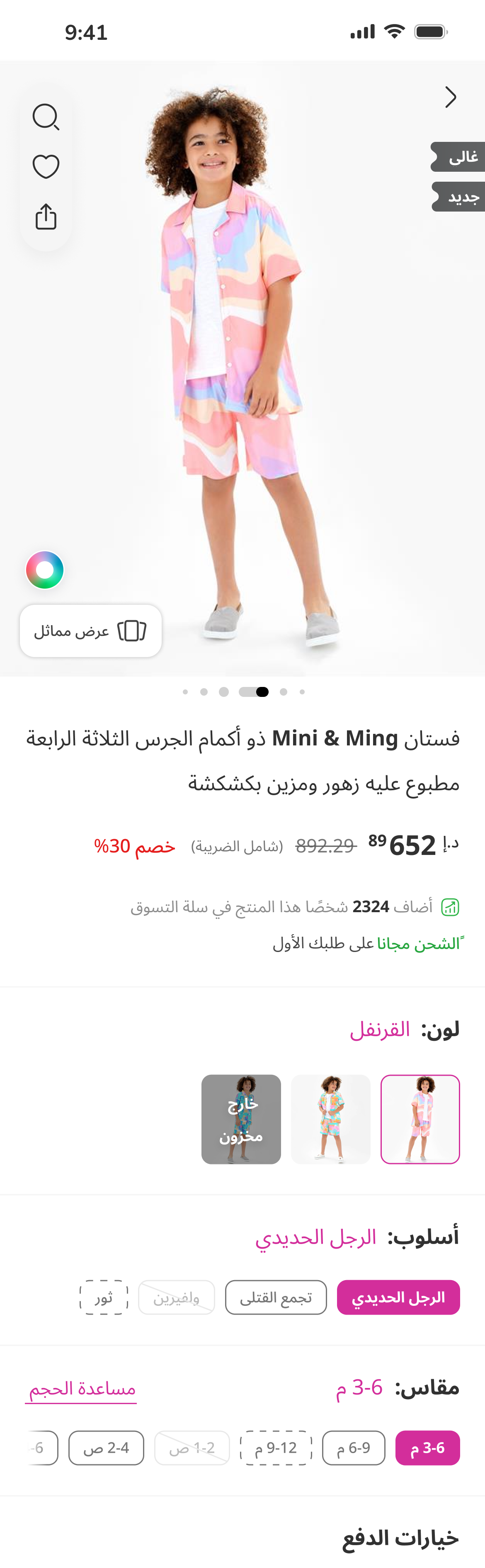
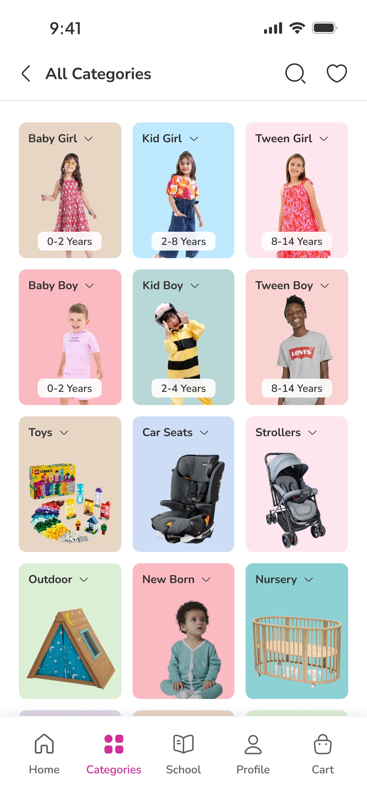
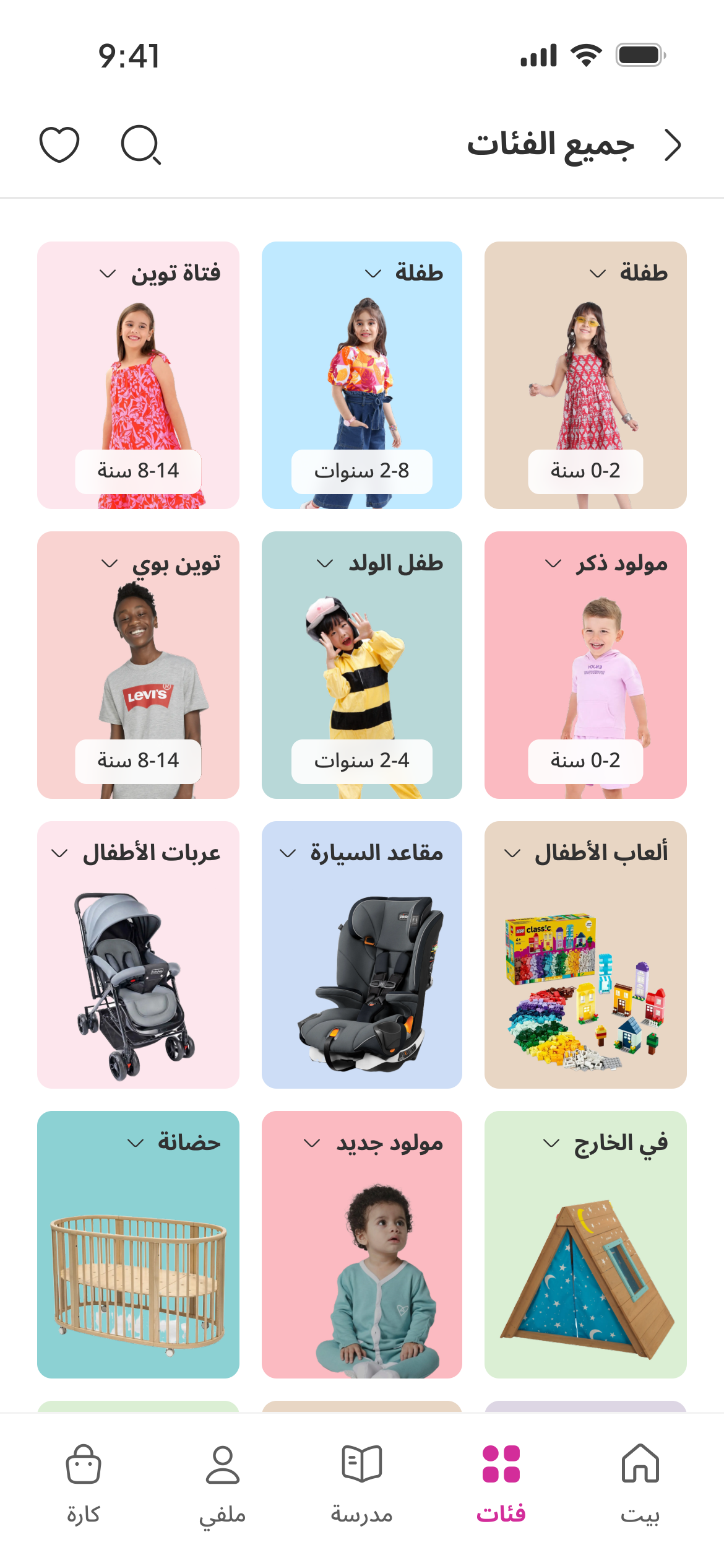
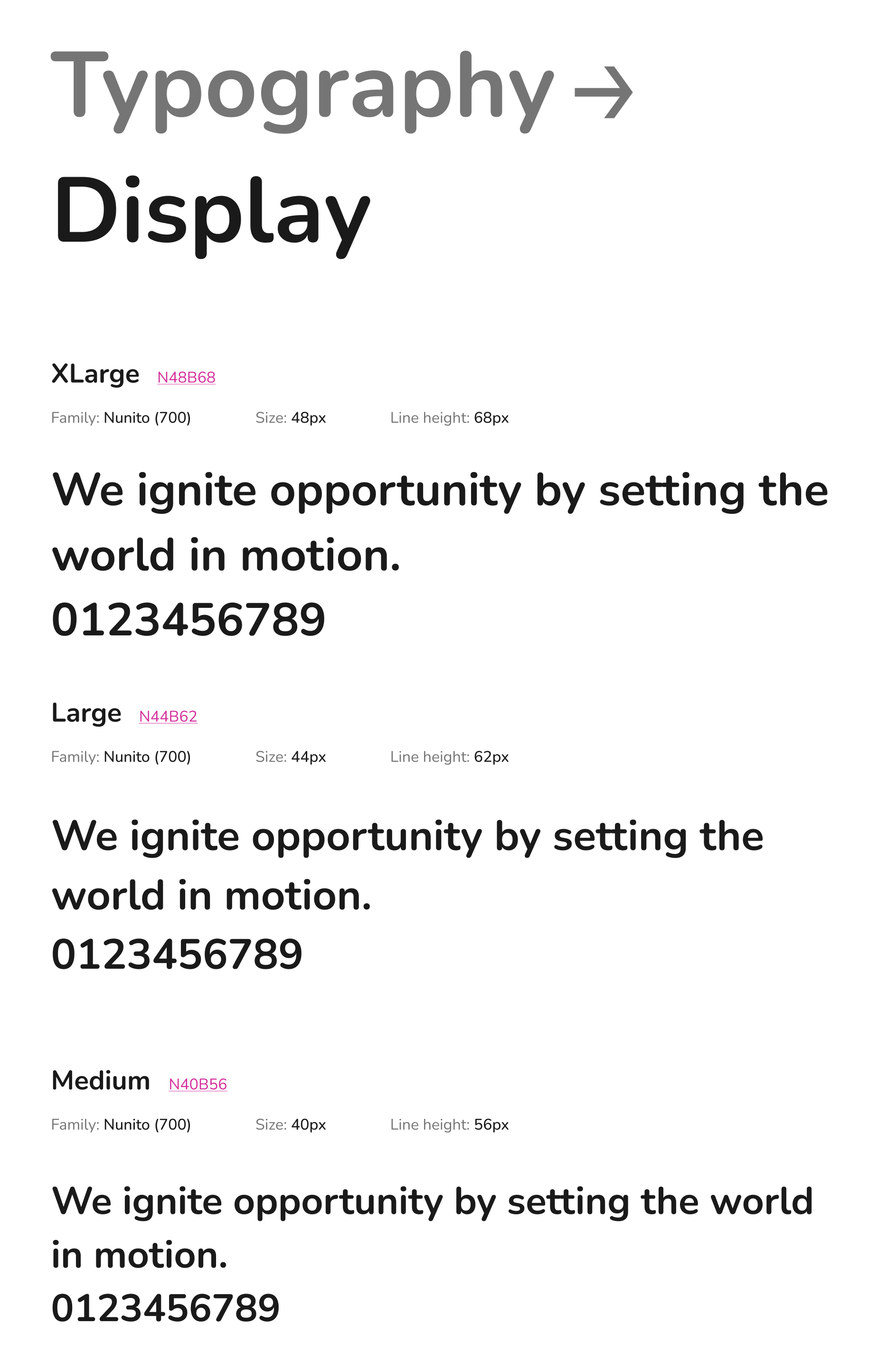
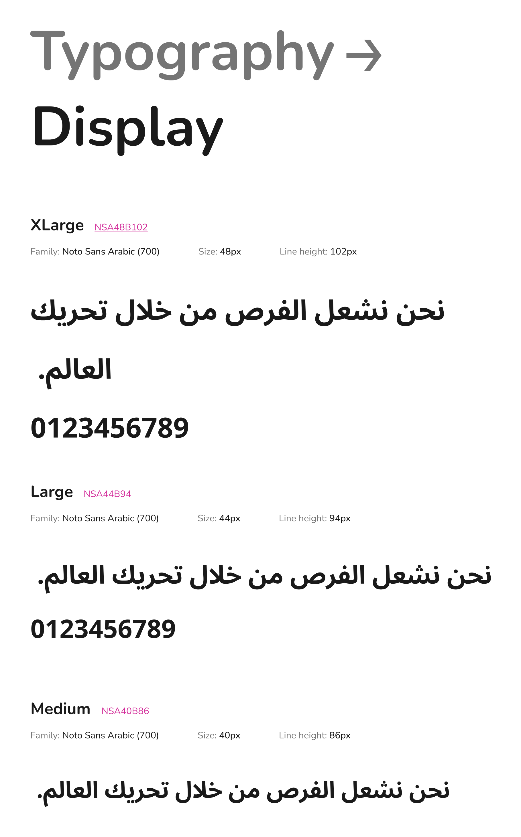
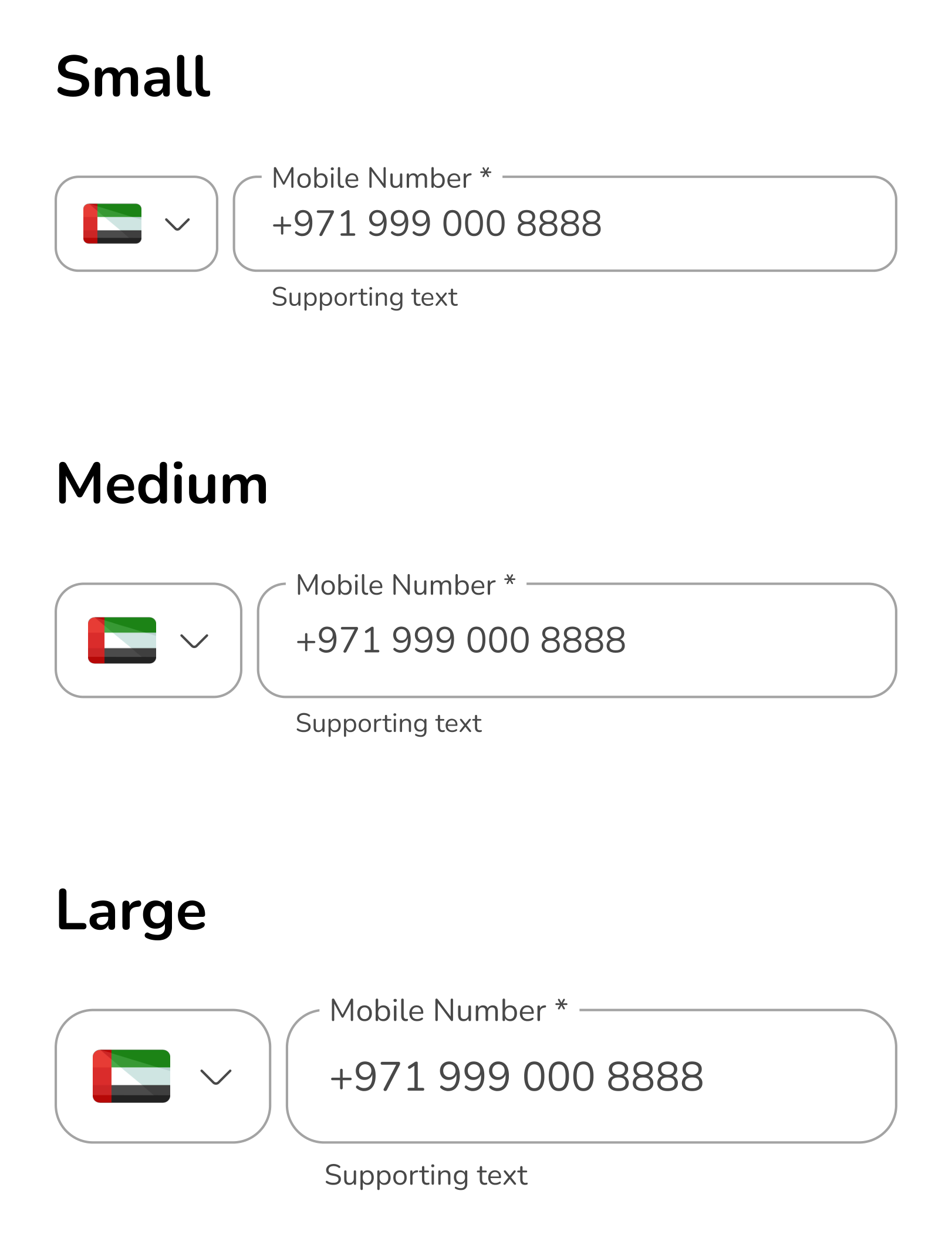
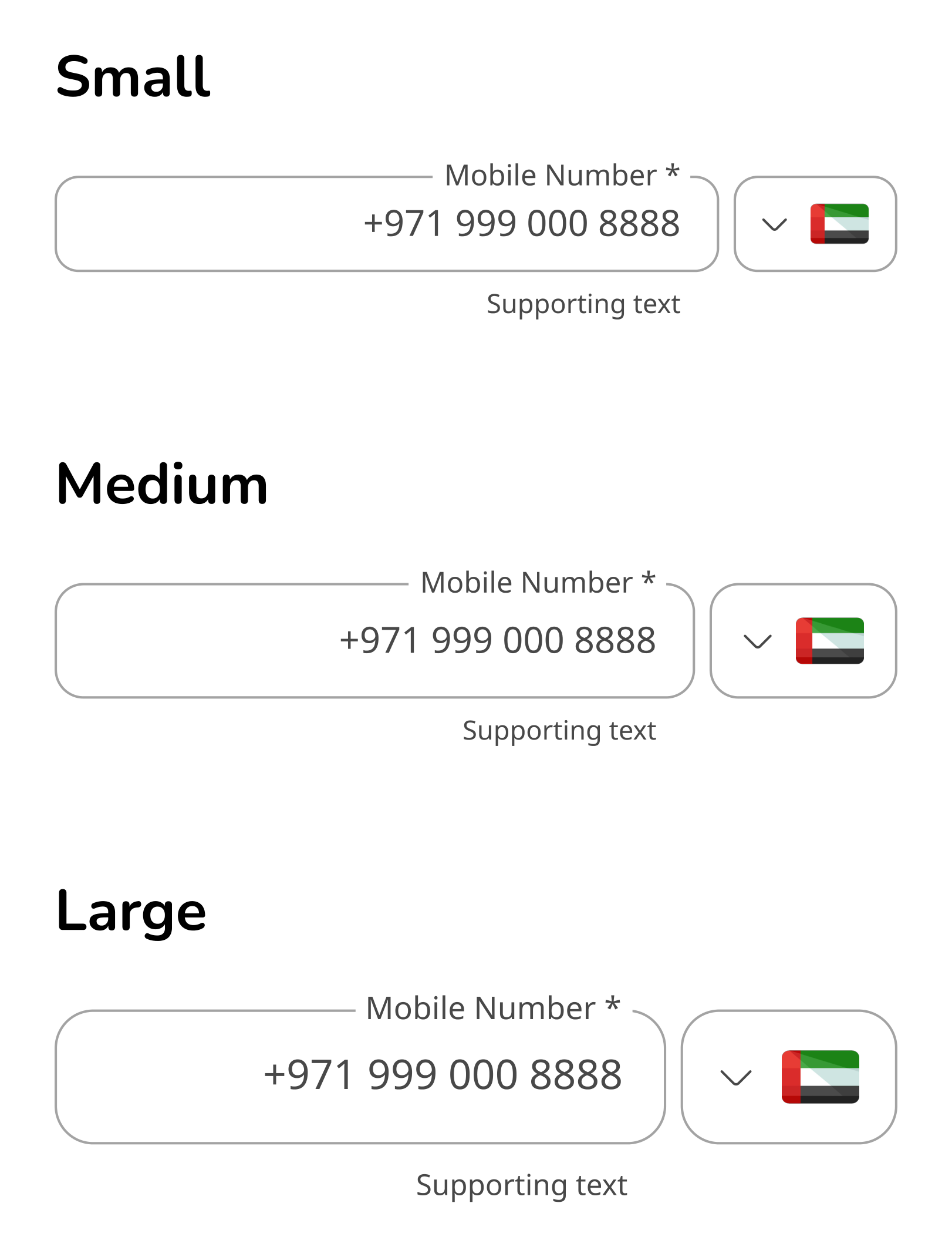
The design system was built entirely in Figma as a single source of truth: a reusable component library with detailed usage instructions and accessibility considerations, empowering faster and more consistent design and development across the Middle East division. Arabic wasn't an afterthought — the type system pairs Nunito with Noto Sans Arabic, and components handle RTL natively.

English

Nunito Regular / Semibold / Bold

Arabic

Noto Sans Arabic Regular / Medium / Bold — full RTL support

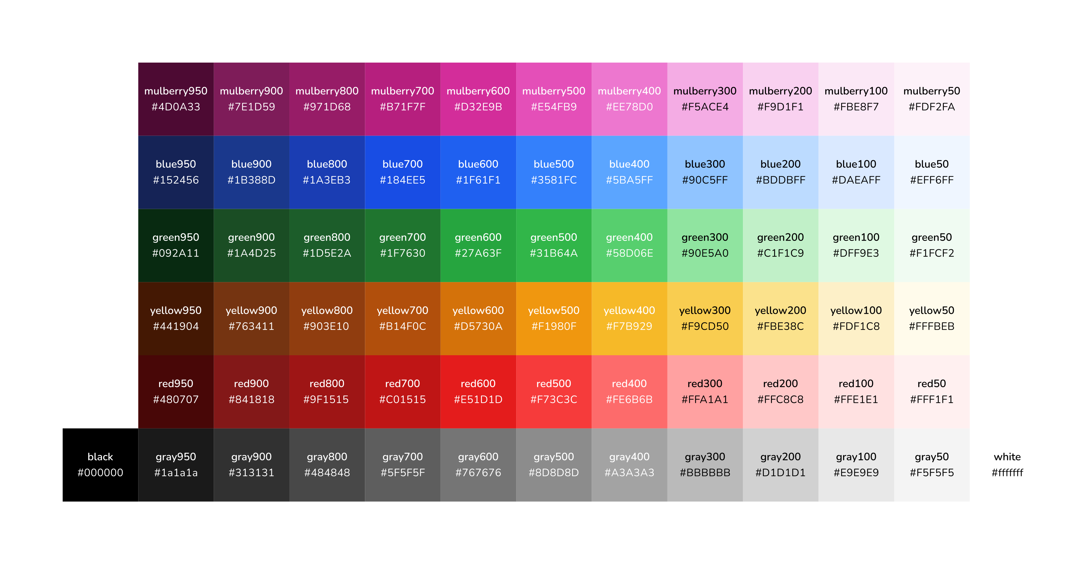
Palette

  • Mulberry #D32E9B
  • Xanthous #F7B929
  • Royal Blue #1F61F1
  • Green #31B64A
  • Jet Black #313131

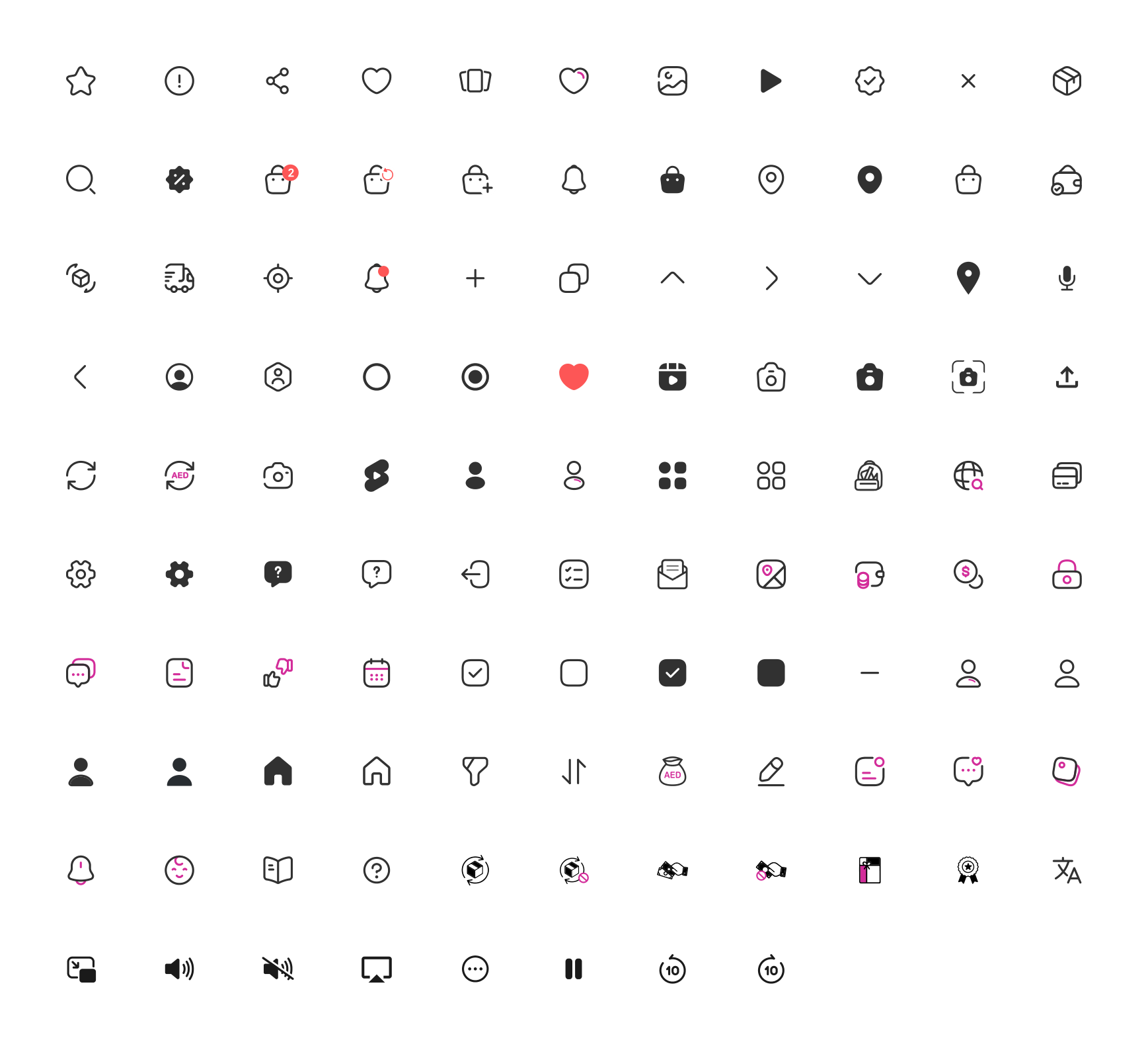
Iconography

Firstcry system icon library

Location field

Locate me and national address components

Buttons & inputs

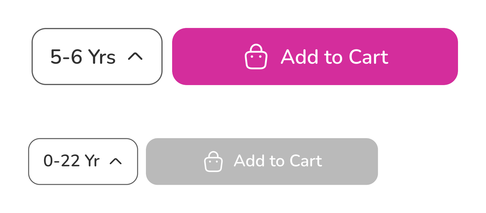
Button, quantity, add-to-cart, entry field, radio and search components

Navigation, cards & chips

Bottom navigation, product card, tags and view-similar components
Fig. C — Component library from the Figma source of truth

A reimagined PDP on a foundation that holds

06 — Solution


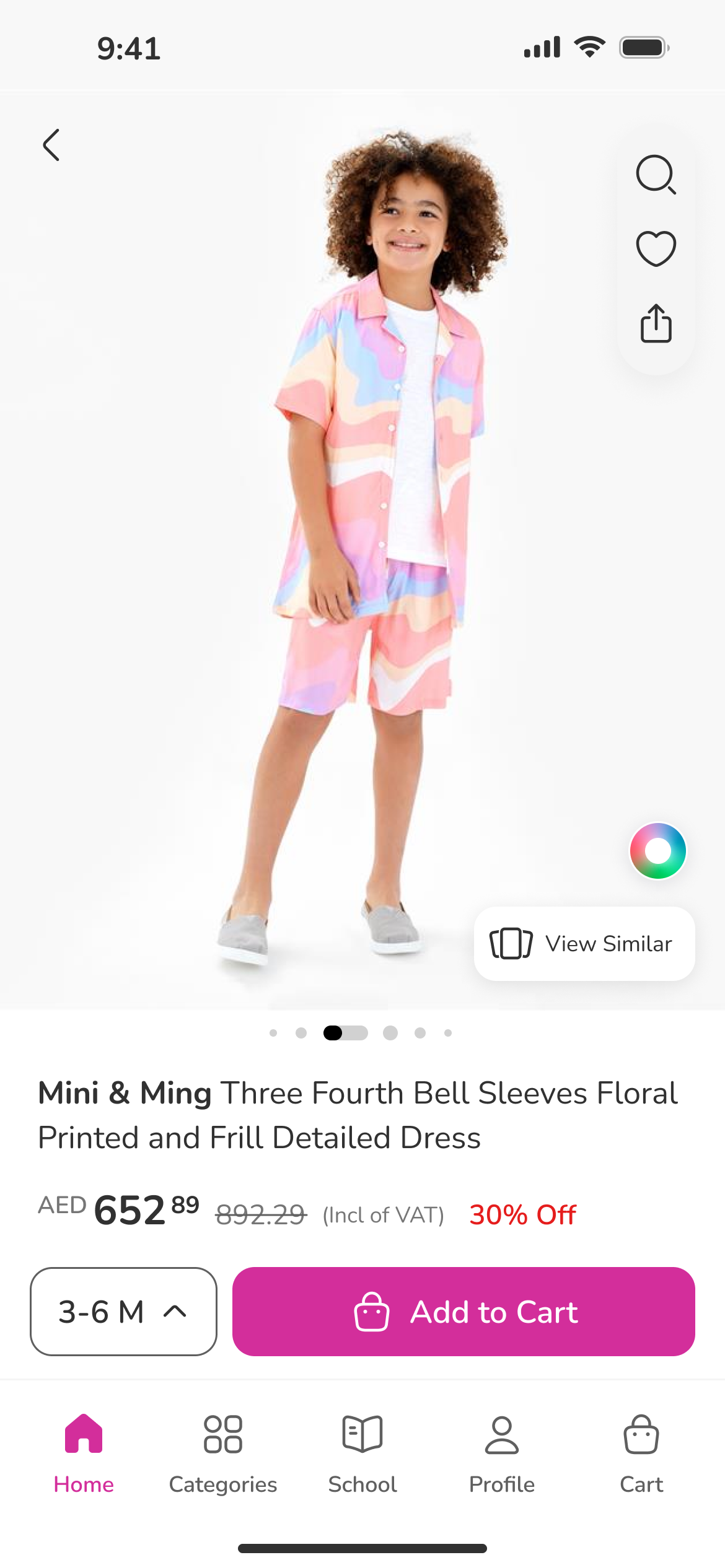
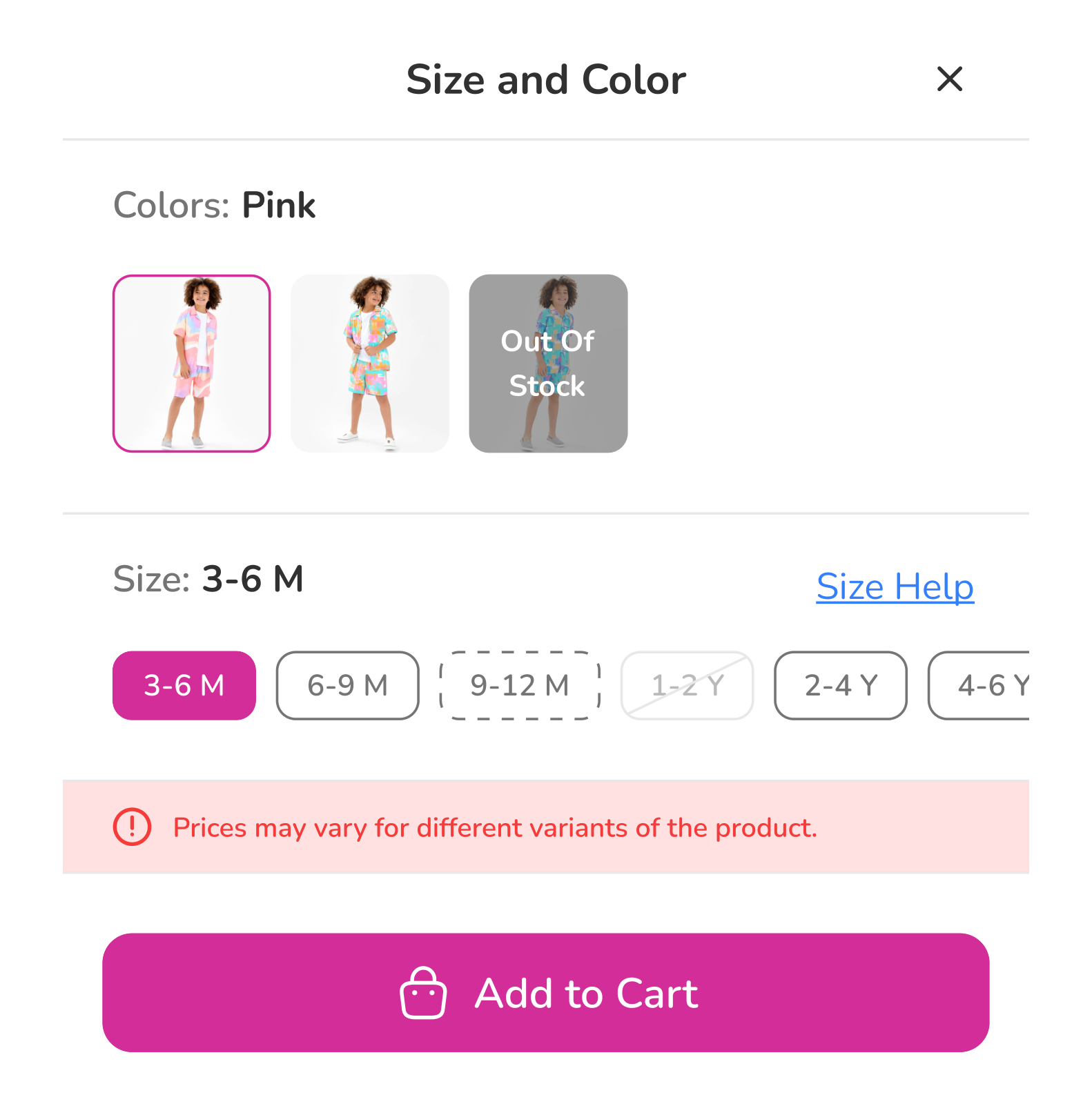
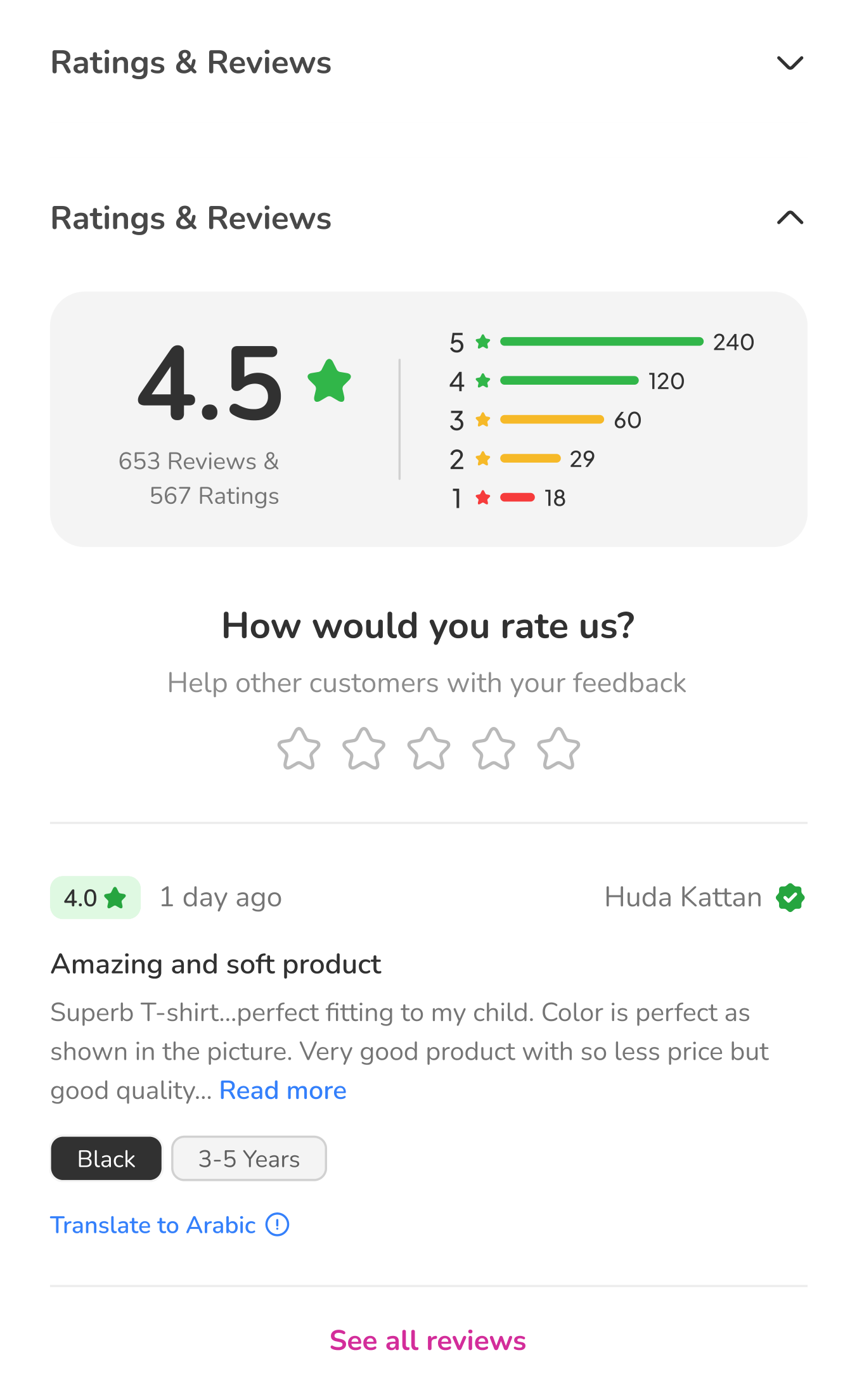
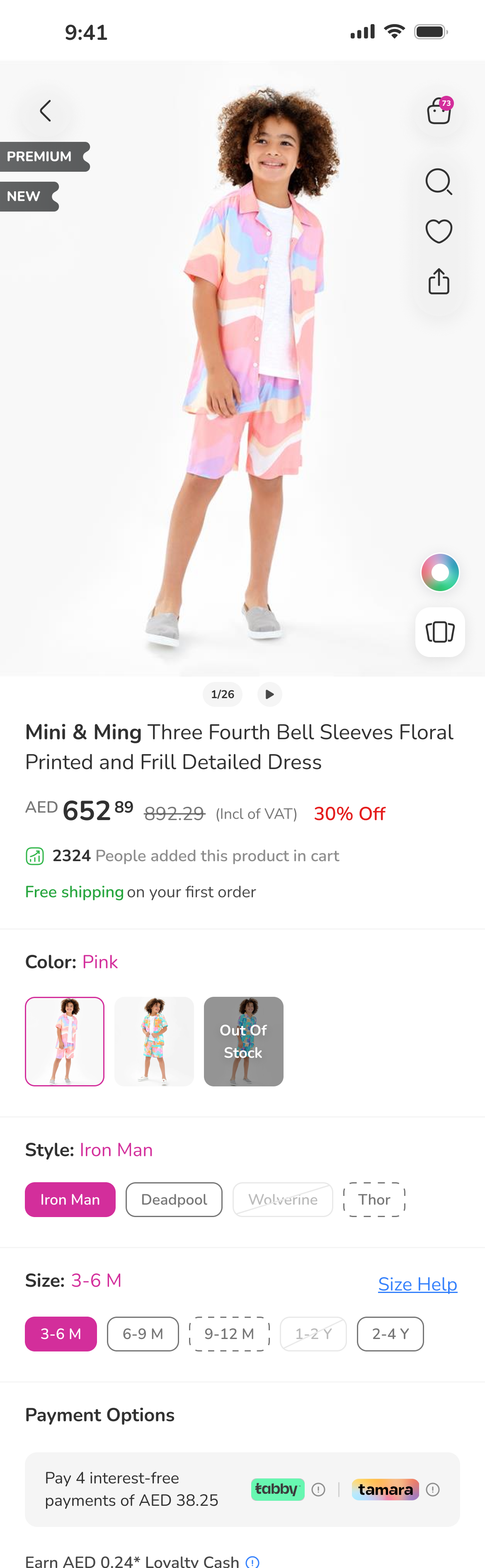
The new PDP is clean and minimalist with enhanced visual hierarchy: improved product imagery presentation, a more prominent call-to-action, clearer product variation selection, and integrated customer reviews for social proof. Because every element comes from the system, every future page inherits the fix.

Firstcry homepage and Arabic variant-selection screens
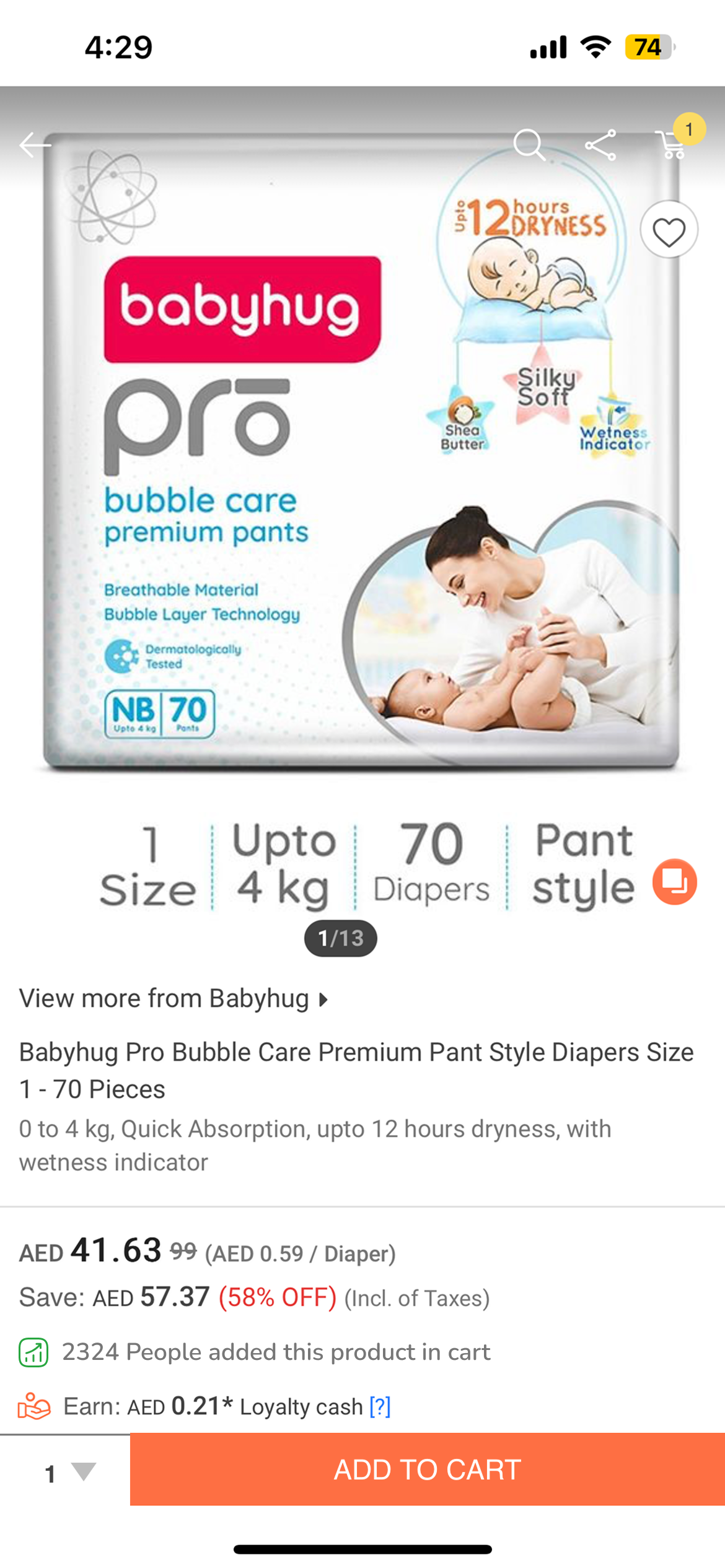
Redesigned product page in English and Arabic

Measured, not claimed

07 — Outcomes


−35%Cart abandonment on the redesigned PDP flow (approx.)
−40%QA defects after the design-system migration (approx.)
1 systemFigma library adopted as the division's single source of truth

Also on Behance

08 — Companion board


A visual companion to this page — board layouts, additional screens, and the design system in presentation form — is posted on Behance.

View the Behance board